– a blog about my work, research, ideas, typography and passion for books.
03.05.2016
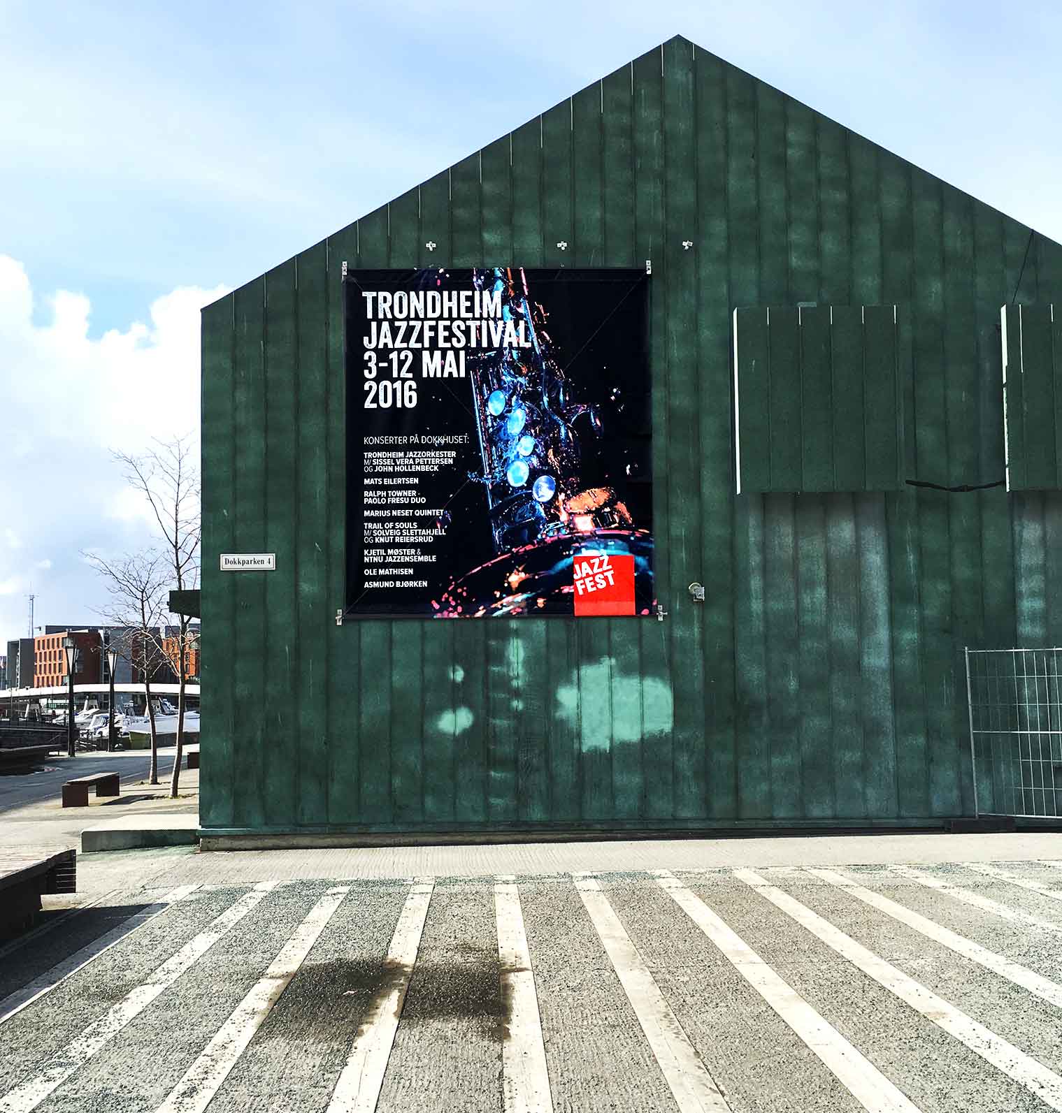
WORK | I worked with Jazzfest from 2005 – 2009; developed the identity and created the marketing material. Now the client is back, and I have worked with this year’s festival newspaper, program, poster and t-shirt. Very nice to work with “old” customers again.
The photographer behind the festival illustration is Ingvild Katrine Lines, student at Norsk Fotofagskole in Trondheim
20.04.2016
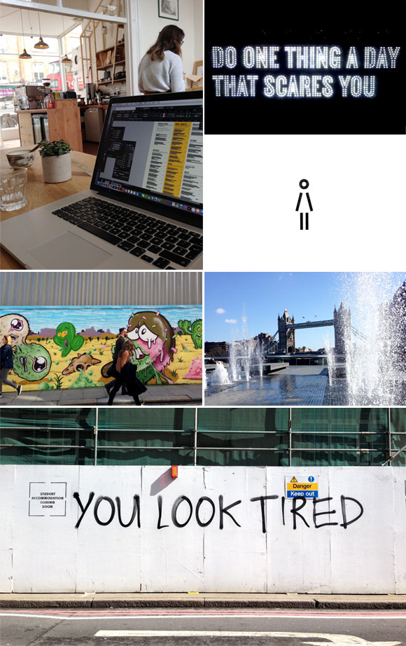
TRAVEL AND INSPIRATION | Went to London for a week to work and get inspiration. Bringing my Mac, working in cafes in my neighborhood, wandering around to look at typography, signs, visiting museums, galleries, bookstores, listening to Messiah by Handel in Royal Albert Hall, walking, drinking coffee. Having a great time. 15 years since I went to London College of Communication. Nice to be back.
06.04.2016
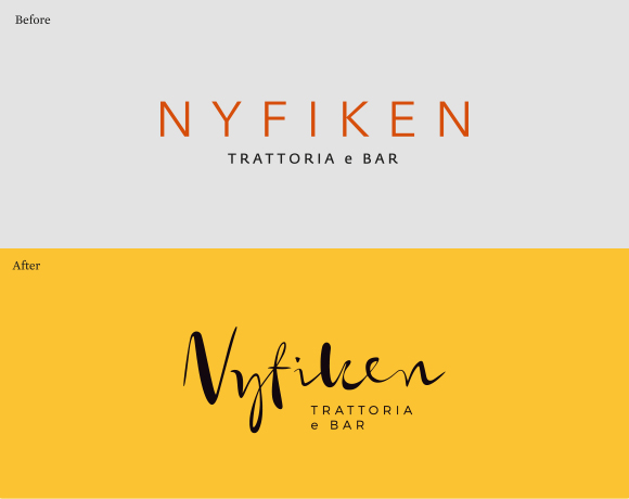
WORK | Nyfiken is a restaurant in Trondheim serving Italian food. The task was to rebrand the identity to give the guests a stronger feeling of a taste of Italy through new logo, color palette and typography. The new logo is hand-drawn and gives a personal and warm expression that welcomes the guests. See more from the Nyfiken identity.
17.02.2016
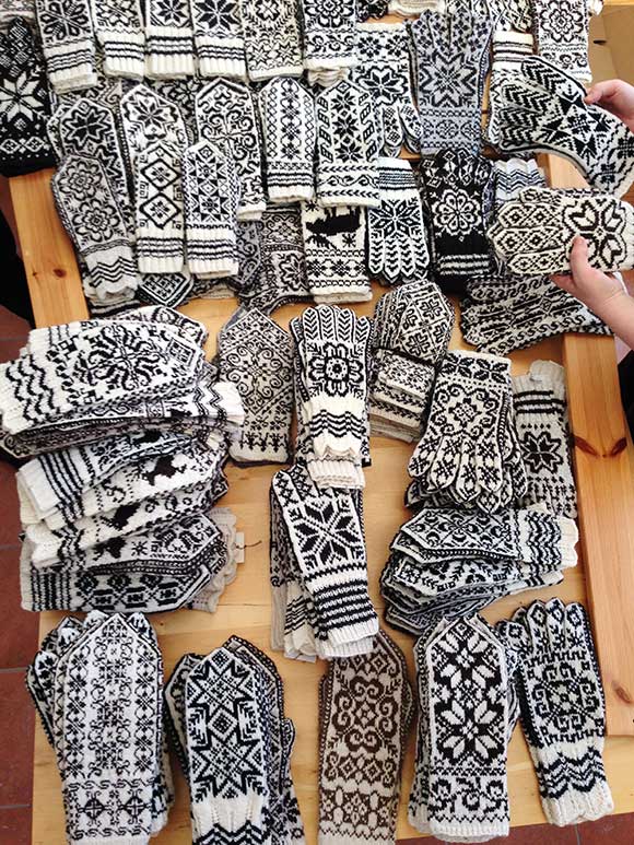
WORK | Together with the author Anne Bårdsgård I am designing a new, large book about Selbu mittens. Anne has worked on the material of this book for three years. She has been keen to find and register as many old pattern as possible. In addition, it has been important to find as much knowledge as possible about knitting mittens to create an overview of procedures. The book will contain history and characteristics of a mitten from Selbu, how to knit together with various patterns. Anne has also made an exhibition related to Selbu mittens.
05.12.2015
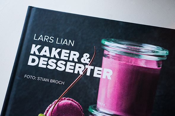
WORK | In collaboration with photographer Stian Broch this has become a great book with wonderful pictures and exciting recipes. The book has received a clean design that suits the images and makes the book very attractive and delicate.
Lars Lian is a well known pastry chef in Norway with many years experience as a TV chef, food writer and author of several cookbooks. Stian is a commercial photographer from Norway. His main area is food-photography. stianbroch.com. See more from the book.
15.11.2015

PERSONAL PROJECT | New year, new annual report for Bodil, my own company. This year the theme is pattern. Our lives are filled with patterns, we can see them everywhere; outside, inside, in nature, on signs, clothing, interior, vegetables… Pattern can be simple or incredibly complex. Pattern is often used by designers, it’s easy to use, yet so difficult. How do we communicate with pattern, what should it say, what colors to use, what forms must be designed and repeated? The possibilities and combinations are endless. Pattern can stand out, do the job unique, it can surprise and make sure we understand. How can we analyze and deconstruct, create rhythm and always find new details. This years annual report reflects around some of these questions.
19.10.2015
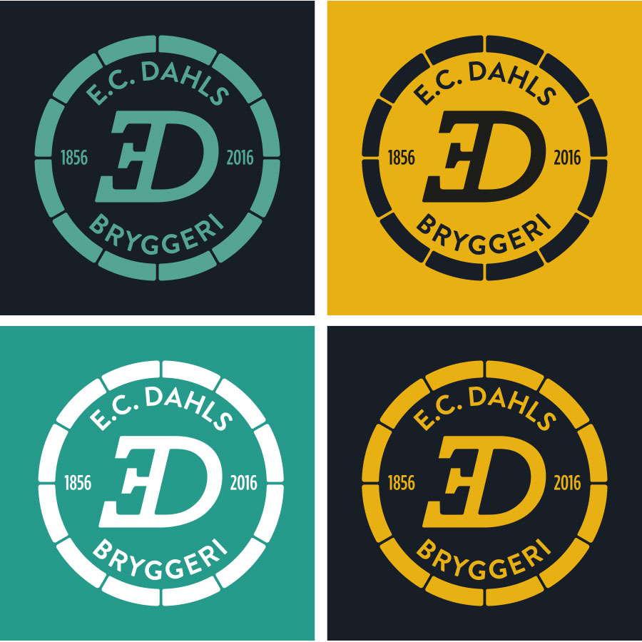
WORK | In cooperation with Ingrid Baadnes and Nina Fjelnset from ablemagic we have worked with the new identity for E.C. Dahls Bryggeri in Trondheim. E.C. Dahls Bryggeri was founded in 1856, and in 2015 a collaboration between E.C. Dahls Bryggeri and the renowned Brooklyn Brewery, New York started. The brewery will reopen late summer 2016 with a restaurant and a pub, in addition to that the brewery will produce both popular local Dahls beer, as well as new craft beers that take inspiration from both Norwegian and US craft brewing traditions.
We have worked closely with Ringnes and the people from Brooklyn Brewery when developing the identity for the brewery. The logo of E.C. Dahls Bryggeri is a new, modernized version of the old E.C. Dahls Bryggeri logo; the inverted, italic E. This creates a high level of recognition. It is built on tradition, but the simplification creates a more modern expression. The brewery opens its gates to the public. The symbol is not within a closed circle, but an open one, that might give associations to a classic beer barrel. See more from the visual identity.
01.10.2015
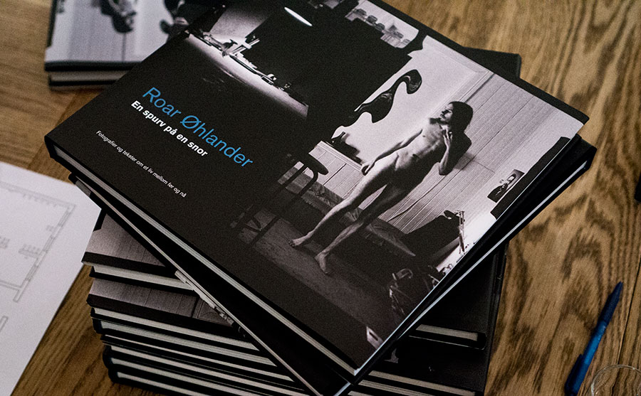
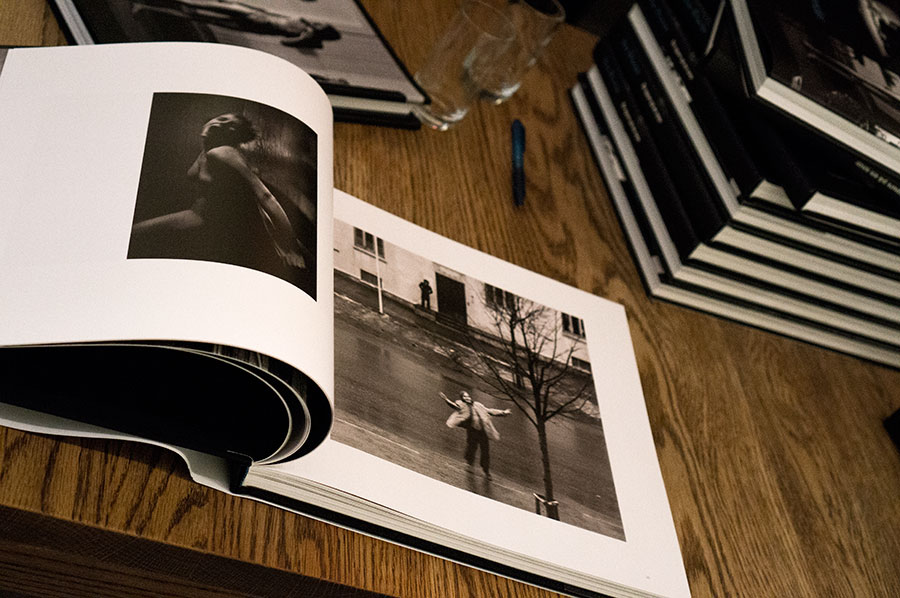
WORK | Roar Øhlander has worked as a photographer in Trondheim since 1969. He has worked with many genres, from portrait to architecture photography, including images from his daily life and personal events. I have designed a large photo book where selection of his images is collected. The book was launched in conjunction with an exhibition in Trondheim Kunstforening. See more from the book En spurv på en snor / Bird on the Wire.
20.07.2015
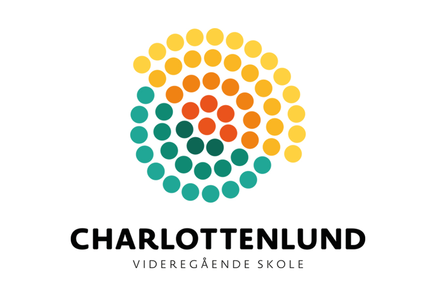
WORK | Working with the visual identity for Charlottenlund videregående skole (Charlottenlund upper secondary school) has been an interesting prosess. I have worked closely with the customer with workshop, meetings and discussions before we found the final solution. The identity is based on the values vibrant, engaged and solid and the motto growing talents. The logo symbol is therefore designed to show growth, direction and diversity through expressions and colors. See more from the visual identity.
09.06.2015
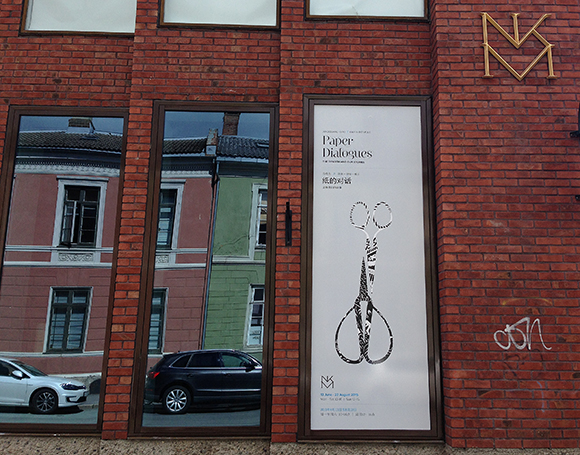
WORK | The Paper Dialogues exhibition has now reached its final destination; Nordenfjeldske Kunstindustrimuseum in Trondheim 13 June – 23 August. The exhibition is a collaboration between Xiaoguang Qiao from China and Karen Bit Vejle from Scandinavia. The amazing paperclips has been shown in Beijing, Shanghai, Oslo and is now in Trondheim. Take a look at the catalogue and the visual identity.