I’m Bodil, a book and identity designer from Trondheim, Norway, holding a PhD in Typography & Graphic Communication from the University of Reading. My research interest concentrates on the verbal and visual presentation of health messages on food labels dating from 1850 to 1970. Please read my blog and have a look at my work. Feel free to get in touch if you think there is something I can do for you. Get in touch ›
– a blog about my work, research, ideas, typography and passion for books.
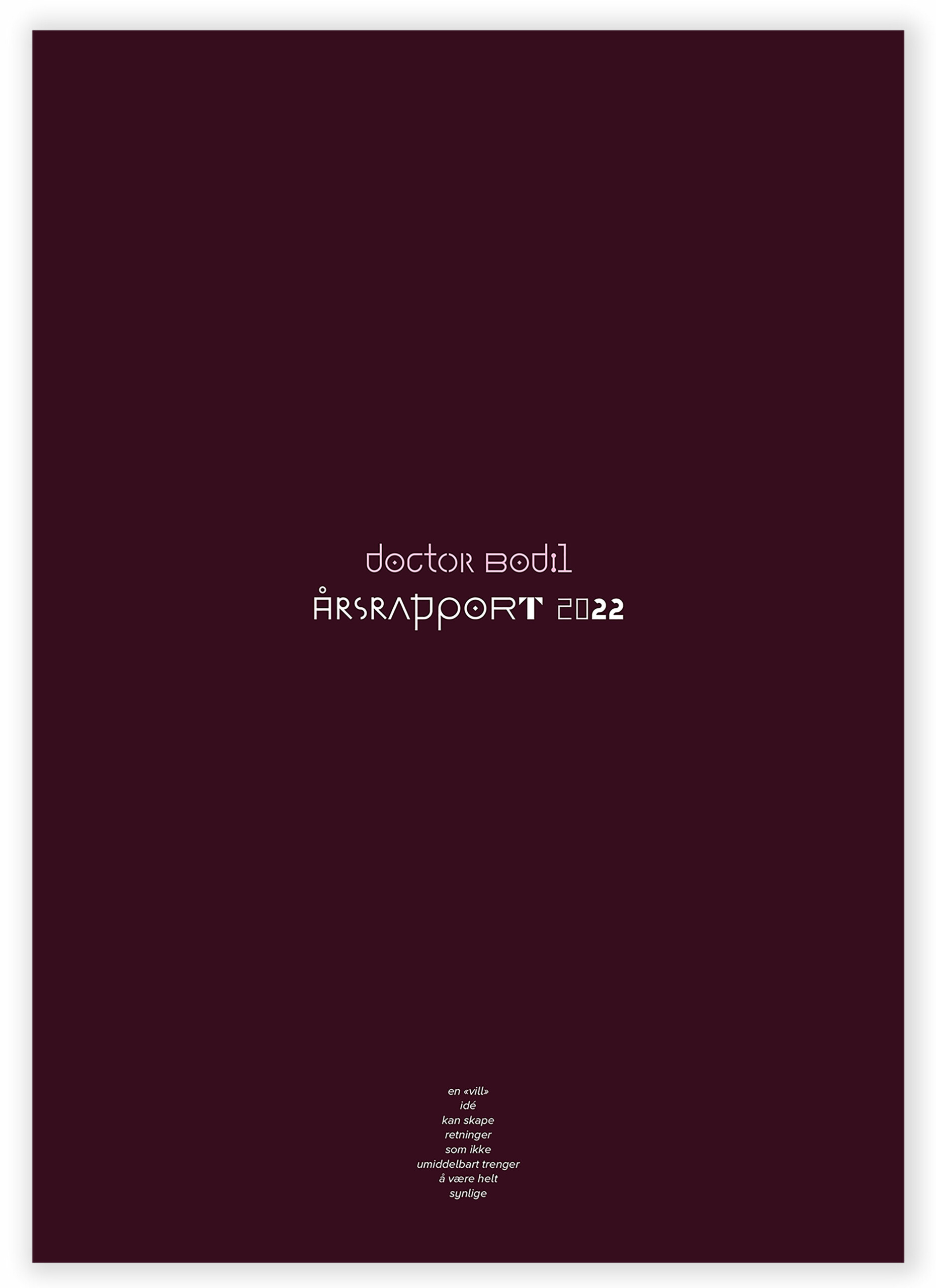
WORK | In 2022, the year was primarily characterized by the completion of my doctoral degree, the Viva voce examination, minor adjustments, submission, and graduation. However, my life as a book and identity designer is gradually starting to mirror the annual report.
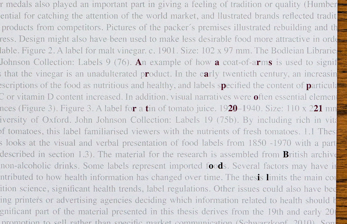
WORK | 2021 has been characterized by a life in the world of letters and texts. Everything has revolved around research, language, sentences, explanations, understanding, labels, presentation, structure, more structure, more sentences, corrections, fine-tuning, abstracts, and conclusions.
WORK | This year’s annual report for my own business is characterised by a year with a pandemic, lockdown, writing, frustration, face masks, rules, testing, new rules, restrictions, tiredness and difficulty focusing. Most of the time spent on working is related to the thesis, in addition to a few design projects, such as finalising the book about Selbu patterns and identity for EiP (Everything is Possible).
WORK | Operating simultaneously as a graphic designer and researcher is not always easy and several days contains work from both disciplines. My everyday life inspires this year’s annual report for my own company, from the food I am eating, where I am working, what I am reading to travels, archives and preparations for new book projects.
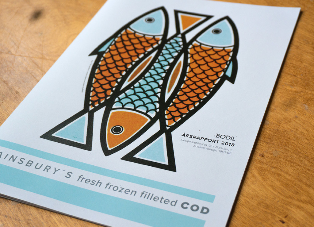
WORK / PERSONAL PROJECT | As my PhD is a full-time study, 2018 has been characterised by more research than design projects. The annual report for my own company is therefore visually inspired by food labels and in particular Sainsbury´s packaging design from 1950-60. The front page is part of a label from 1964 from The Sainsbury´s Archive, Museum of London Docklands.
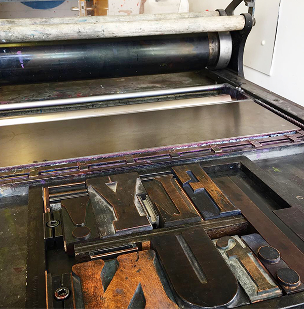
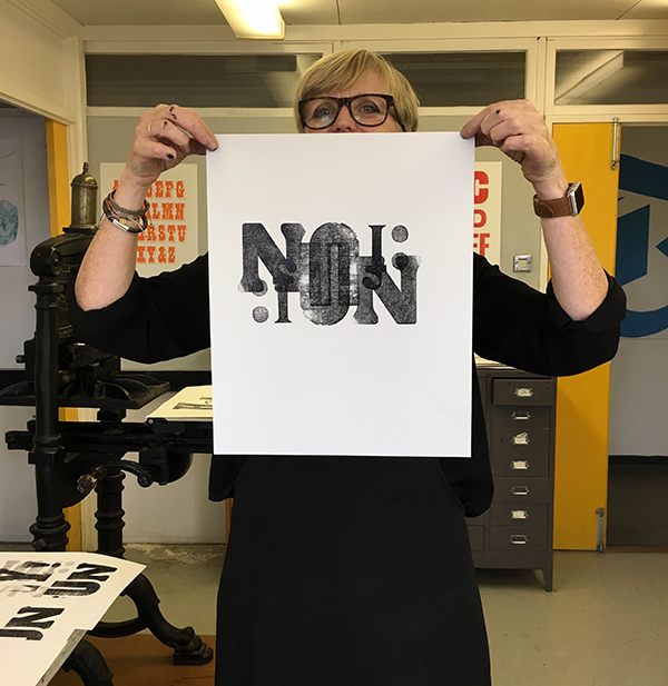
PERSONAL PROJECT | Learning how to use the material for working with letterpress. Department of Typography & Graphic Communication, University of Reading. Looking forward to working with more letterforms and colours.
PERSONAL PROJECT | A new step. This years theme for my annual report is how 2017 was divided into 2/3 design and 1/3 research. Design projects, the beginning of my doctoral research in September, a new everyday life, a lot of reading, searching for food labels, frustrations, happiness, curiosity and some few design projects…
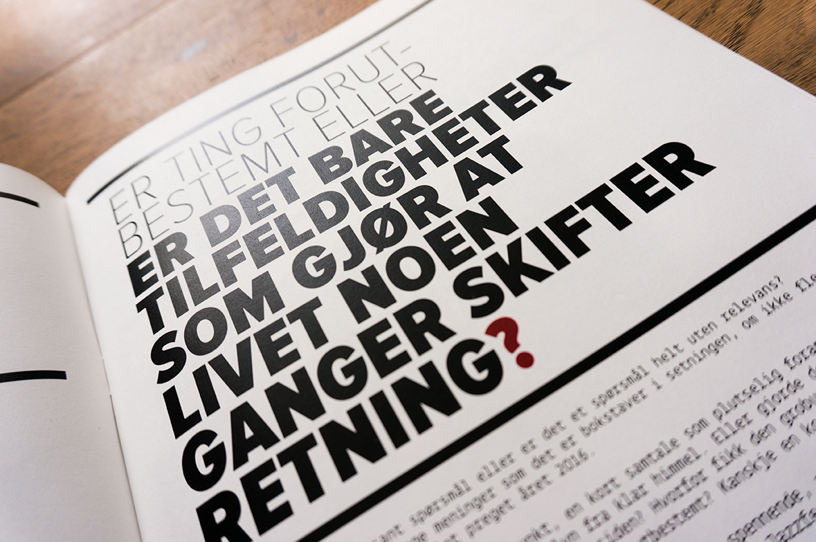
PERSONAL PROJECT | Are things predetermined or is it just a coincidence that life sometimes change direction?
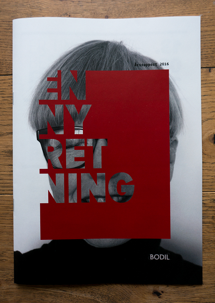
This year´s theme for my annual report is about how a talk with a former colleague in 2016 changed my perception of my own company, my business and my everyday life for the next three to four years… Or maybe for the future? She told me about a Norwegian Professor who has a Research Degree in Typography. I was inspired and suddenly realized that I was ready to slowly change my career. Where does this decision brings me? – I don´t know – time will show.
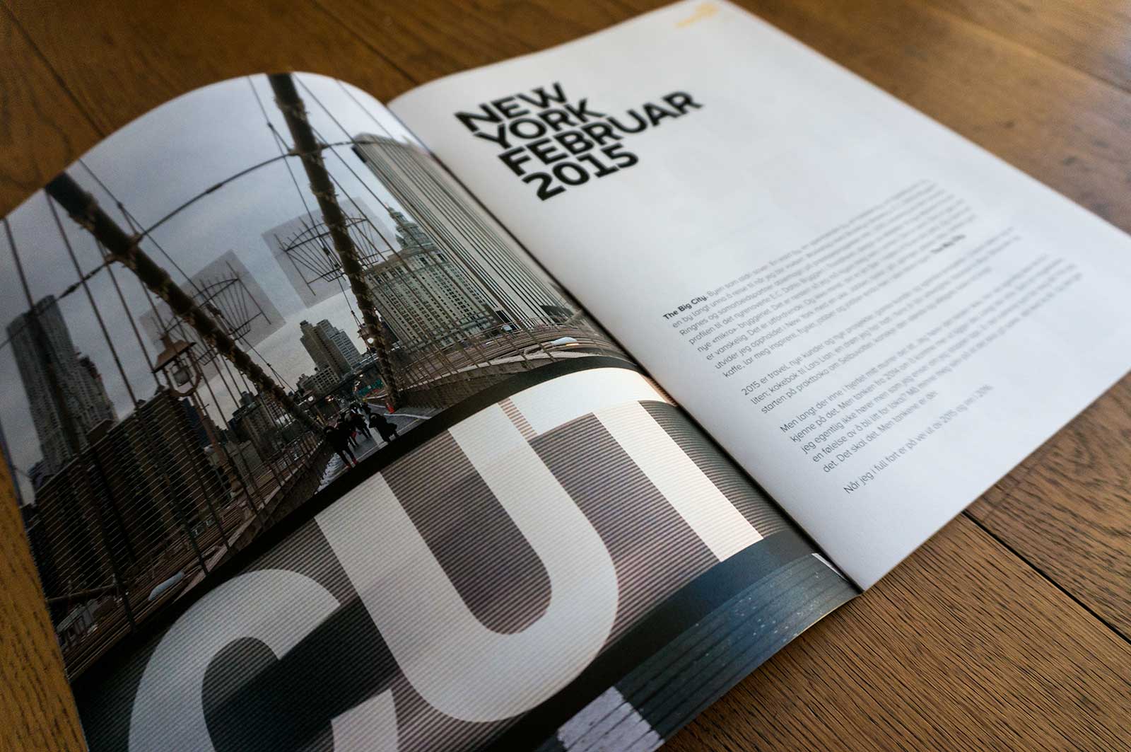
PERSONAL PROJECT | Annual report 2015 for Bodil, my own company. The theme this year is New York, based on my trip to the Big City in connection with a workshop with Brooklyn Brewery, Ringnes and ablemagic regarding development of the visual identity for E.C. Dahls Brewery. Otherwise the report consists all my work done in 2015, travels and all the exciting numbers…
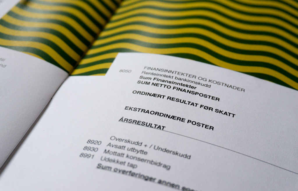
PERSONAL PROJECT | New year, new annual report for Bodil, my own company. This year the theme is pattern. Our lives are filled with patterns, we can see them everywhere; outside, inside, in nature, on signs, clothing, interior, vegetables… Pattern can be simple or incredibly complex. Pattern is often used by designers, it’s easy to use, yet so difficult. How do we communicate with pattern, what should it say, what colors to use, what forms must be designed and repeated? The possibilities and combinations are endless. Pattern can stand out, do the job unique, it can surprise and make sure we understand. How can we analyze and deconstruct, create rhythm and always find new details. This years annual report reflects around some of these questions.