
E.C. DAHLS BRYGGERI. NEW VISUAL IDENTITY.
19.10.2015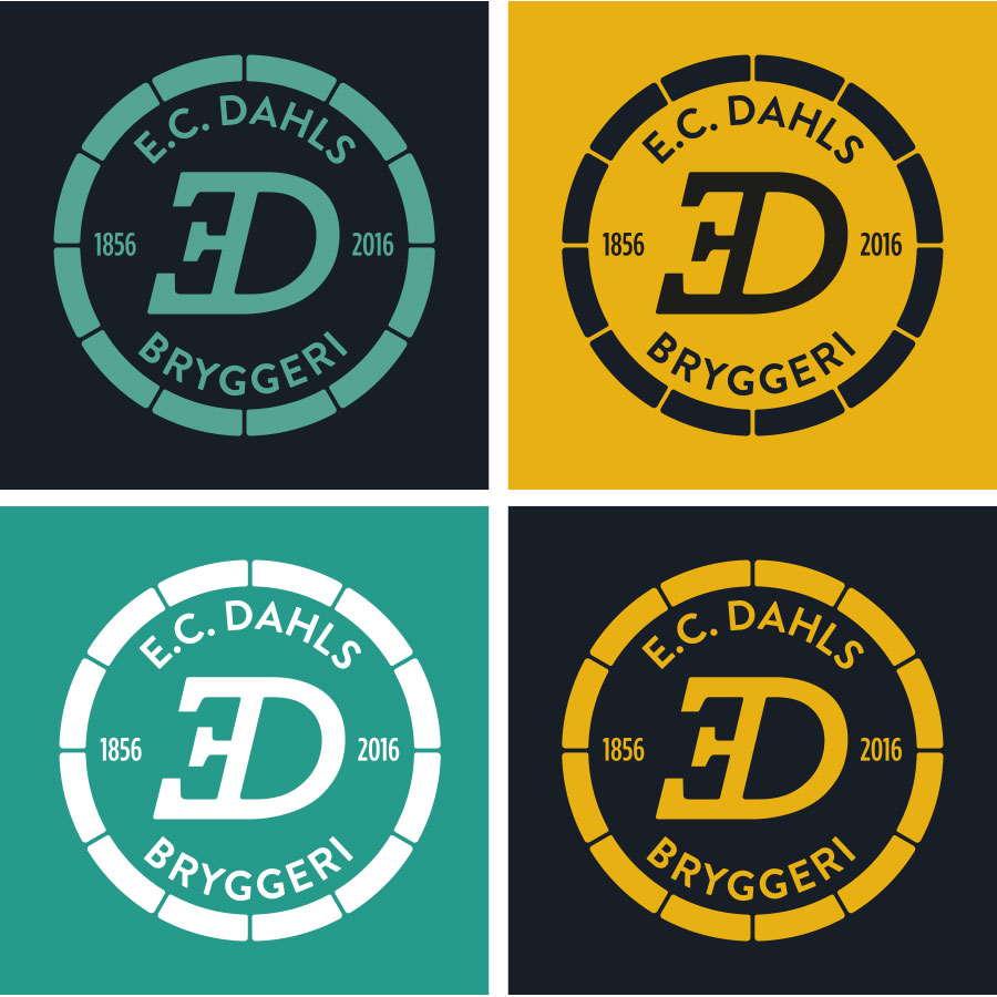
WORK | In cooperation with Ingrid Baadnes and Nina Fjelnset from ablemagic we have worked with the new identity for E.C. Dahls Bryggeri in Trondheim. E.C. Dahls Bryggeri was founded in 1856, and in 2015 a collaboration between E.C. Dahls Bryggeri and the renowned Brooklyn Brewery, New York started. The brewery will reopen late summer 2016 with a restaurant and a pub, in addition to that the brewery will produce both popular local Dahls beer, as well as new craft beers that take inspiration from both Norwegian and US craft brewing traditions.
We have worked closely with Ringnes and the people from Brooklyn Brewery when developing the identity for the brewery. The logo of E.C. Dahls Bryggeri is a new, modernized version of the old E.C. Dahls Bryggeri logo; the inverted, italic E. This creates a high level of recognition. It is built on tradition, but the simplification creates a more modern expression. The brewery opens its gates to the public. The symbol is not within a closed circle, but an open one, that might give associations to a classic beer barrel. See more from the visual identity.