– a blog about my work, research, ideas, typography and passion for books.
13.10.2014

WORK | Three years has passed by since I visited Beijing for first time to have preliminary discussion with the Norwegian embassy and to meet Professor Xiaoguang Qiao regarding a paper-cut exhibition in China in 2014.
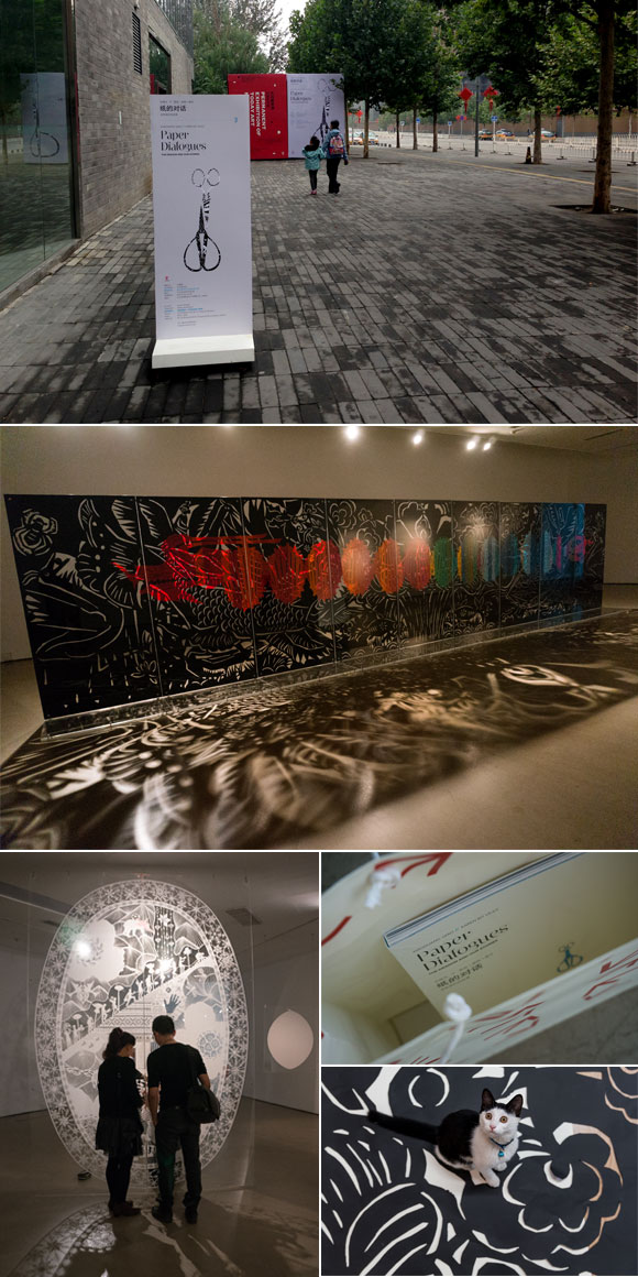
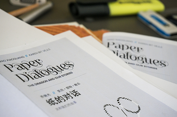
After a lot of preparation, including designing a 120 pages catalogue, invitation, folder, poster, boards and wall texts – and an intensive final week for both Scandinavian and Chinese team members – October 1 we could finally open the first Paper Dialogues exhibition. It has become a beautiful an evocative installation in Today Art Museum in Beijing with artists Xiaoguang Qiao and Karen Bit Vejle. The official opening was October 5, a lot of people attended, including the Norwegian Ambassador Svein Sæther. The exhibition will also be shown in Liu Haisu Museum in Shanghai, Vigeland-museet in Oslo and in Nordenfjeldske Kunstindustrimuseum in Trondheim. Read more about Paper Dialogues here.
See more from the catalogue here and the visual identity here.
17.09.2014


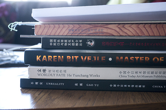
WORK | Looking back to my first trip to Beijing in September 2011 where the idea was to establish contacts for a common paper clip exhibition with Karen Bit Vejle and Xiaoguang Qiao, the project is now a reality. After 3 years of continuous work both for the artists and the project group, the first Paper Dialogues exhibition opens at Today Art Museum in Beijing October 1. Furthermore, it goes to Shanghai, Oslo and Trondheim. Besides being part of the project group, I work with the visual appearance of the exhibition; catalog, marketing materials and parts of the exhibition rooms. It has been a challenging job to get Western and Chinese typography to work together, and it has therefore been important to research both Western and Chinese books, typography, images, and paper. All the material is now almost completed and sent to China for finishing. It will be very exciting to come to Beijing in early October for both to attend the exhibition opening and see my own work complete and ready for use.
30.08.2014

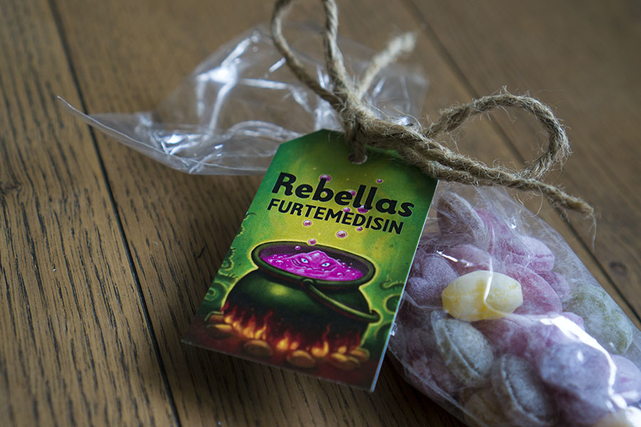
WORK | Rebella is the main character in a magic rock show in Namsskogan Wildlife Park. A few packaging designs/tags for Rebella´s own candy was made for sale in the shop. Illustrations by Sandra Steffensen. See more from Rebella´s packaging design here
30.08.2014

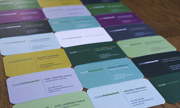
WORK | Based on the new visual identity created for Norwegian Health Network, business cards were developed. Each person has twelve color variations, which emphasize not only the sophisticated colors in the visual profile, but also gives the company a fresh and unexpected look.
15.07.2014

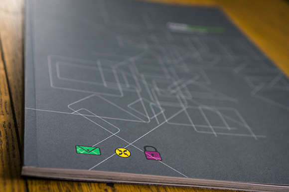
WORK | An annual report for The Norwegian Health Network, Norsk Helsenett is created. Norwegian Health Network’s mission is to ensure that there is an appropriate and secure infrastructure for effective interaction between parts of the health and care systems. A sophisticated grid system that can support the various points of contact that occurs between the various parties in the health sector is developed. The annual report contains many stories that focus on what services and supplies means for people. The work is a cooperation with ablemagic. See more from the annual report here.
19.06.2014

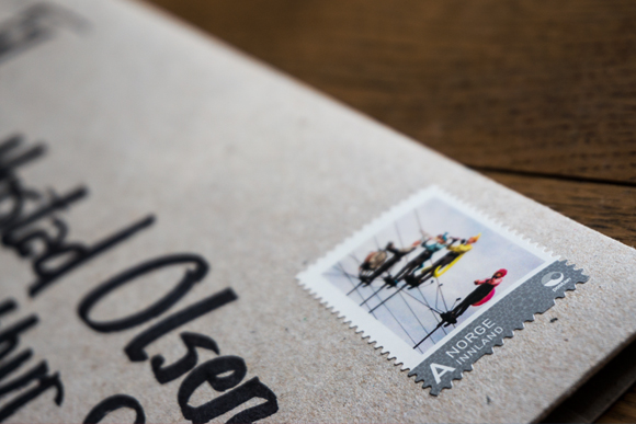
WORK | Cirka Teater has made its mark with a rich, visual, theatrical language. The repertoire ranges from small, intimate performances to stunning outdoor spectacles and main stage productions. The Group is one of the most experienced groups in the performing art scene in Norway. In 2014 Cirka Teater celebrates for 30 years, and in that regard I have made their anniversary invitation. The invitation should reflect the Theatre’s creativity, scope, insanity and humour. The result is a handwritten envelope with an exciting content; folder, invitation, postcards and a rich illustrated map. The illustrations are made by Anne Marit Sæther and Gilles Berger. See more from Cirka Teater here.
30.05.2014

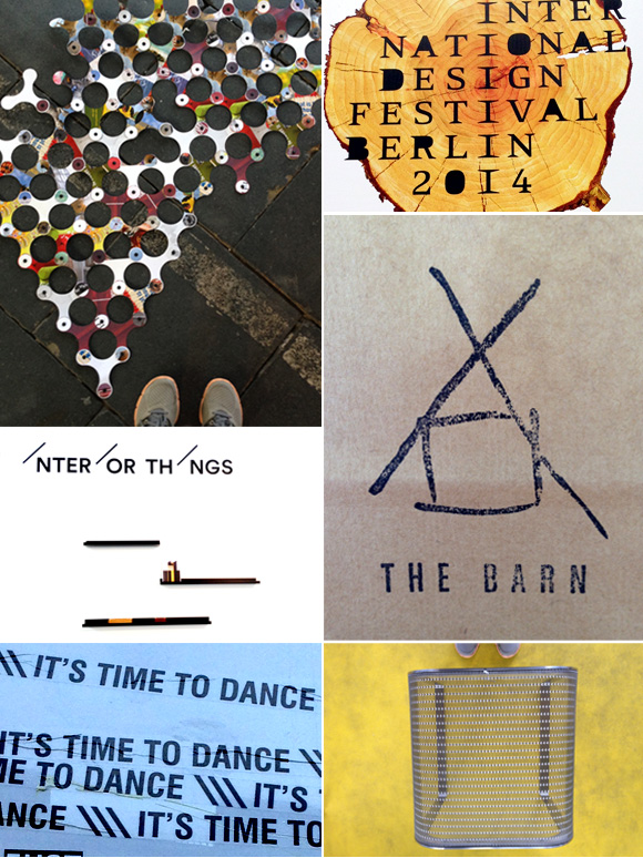
INSPIRATION | Visiting Berlin and the International Design Festival was a great inspiration. I like to be inspired by many things; product design, typography in public spaces, colors, patterns, posters and cafes.
Berlin has everything.
08.04.2014

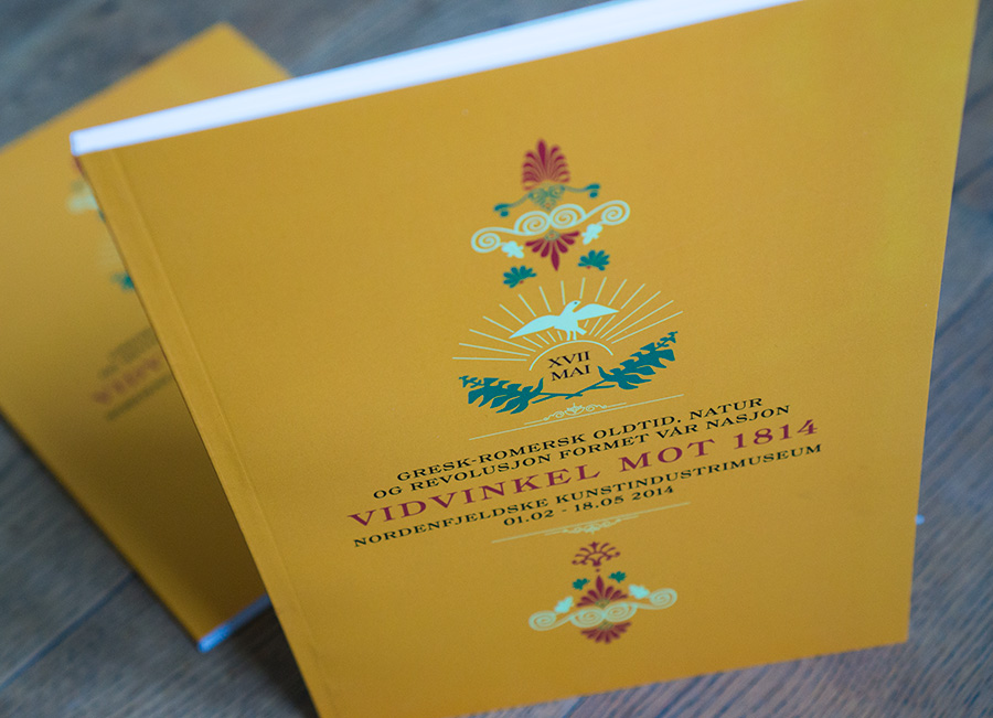
WORK | The Norwegian Constitution is 200 years in 2014, and the museum Nordenfjeldske Kunstindustrimuseum in Trondheim celebrates this anniversary with the exhibition Vidvinkel mot 1814. The catalog is a collection of various essays. The idea behind the catalog was to create an expression from the Greek-Roman antiquity. The colours, typography and the symbols are carefully designed with this period in mind. See more form the catalog here.
26.03.2014

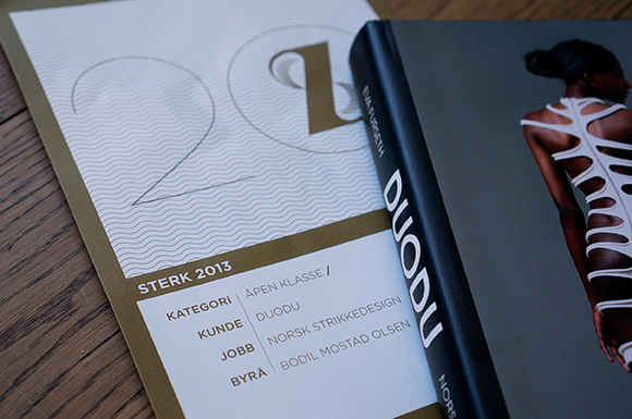
WORK | Happy to announce that the The book DUODU knitwear design achieved diploma in the advertising award Sterk 2013.
18.02.2014


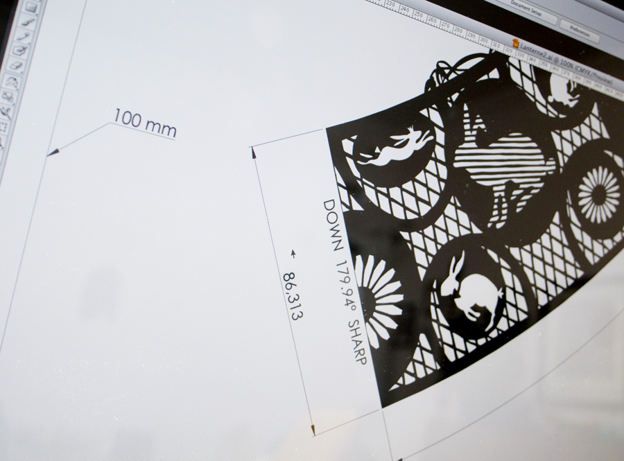
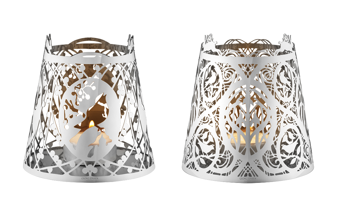
WORK | With extreme accuracy I have converted Karen Bit Vejle’s beautiful paper cut art to correct originals. 6 products are manufactured in polished stainless steel for Georg Jensen’s easter collection 2014, A bit of easter.
Karen Bit Vejles form of expression, psaligraphy, literally means the art of drawing or painting with scissors. Her magical cuttings in the travelling exhibition Scissors for a Brush, are rooted in a tradition that has known a long journey through history. But she has created a personal style and technique that are entirely her own. For more than 35 years she has been absorbed, fascinated, and deeply committed to this art form that developed from small, simple snowflakes to unusually large and highly complex image cuttings. She is one of very few in Europe who can cut at such an advanced technical and artistic level. There is a great degree of humour in Karen Bit Vejle’s world of imagery; humour and the ability to identify joy in small things. Just as often, though, she confronts deep seriousness and themes intended to invoke involvement and reflection. Her works are captivating surprise packages. By meeting Karen Bit Vejle’s images of air and paper we can find ourselves both surprised and inspired! (Text about Bit: www.georgjensen.com/europe/designer/karen-bit-vejle/) See more from Bit, or browse her own website.
