– a blog about my work, research, ideas, typography and passion for books.
19.05.2015
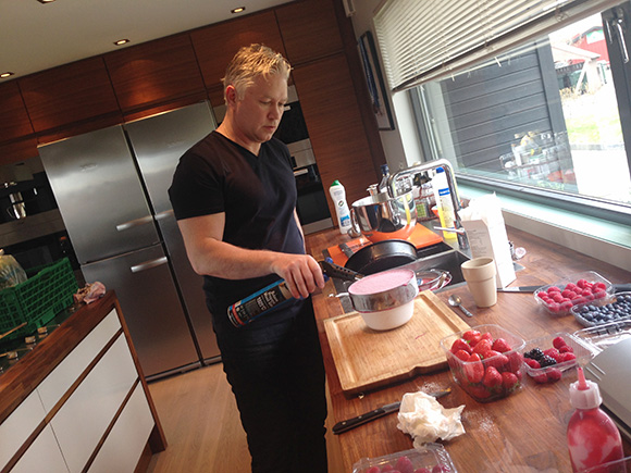
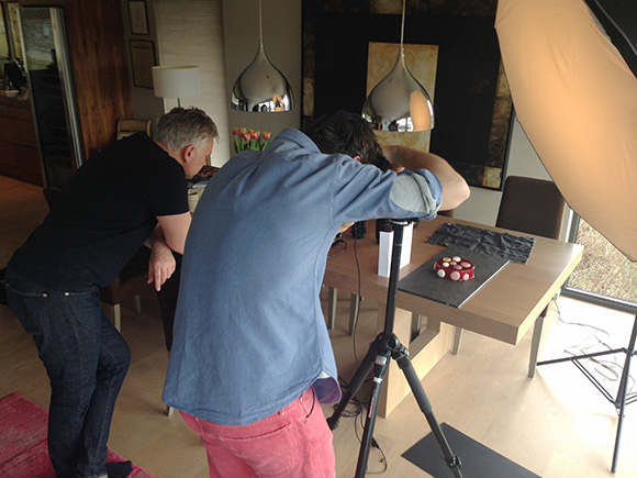
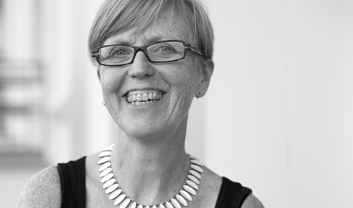
WORK | A new and exciting book project is is under development. I am designing a cookbook for Lars Lian who will publish his favorite cakes and dessert recipes. Lars is a well known pastry chef in Norway with many years experience as a TV chef, food writer and author of several cookbooks. All photos by Stian Broch. Stian is a commercial photographer from Norway. His main area is food-photography. stianbroch.com
18.03.2015

WORK | caccao is a Web page that contains Lars Lians own desserts and cake recipes. Lars Lian is a well known pastry chef in Norway with many years experience as a TV chef, food writer and author of several cookbooks. The work is a collaboration with Eirik Backer. The logo was developed to provide a tasteful and delicious expression. caccao.no
19.02.2015
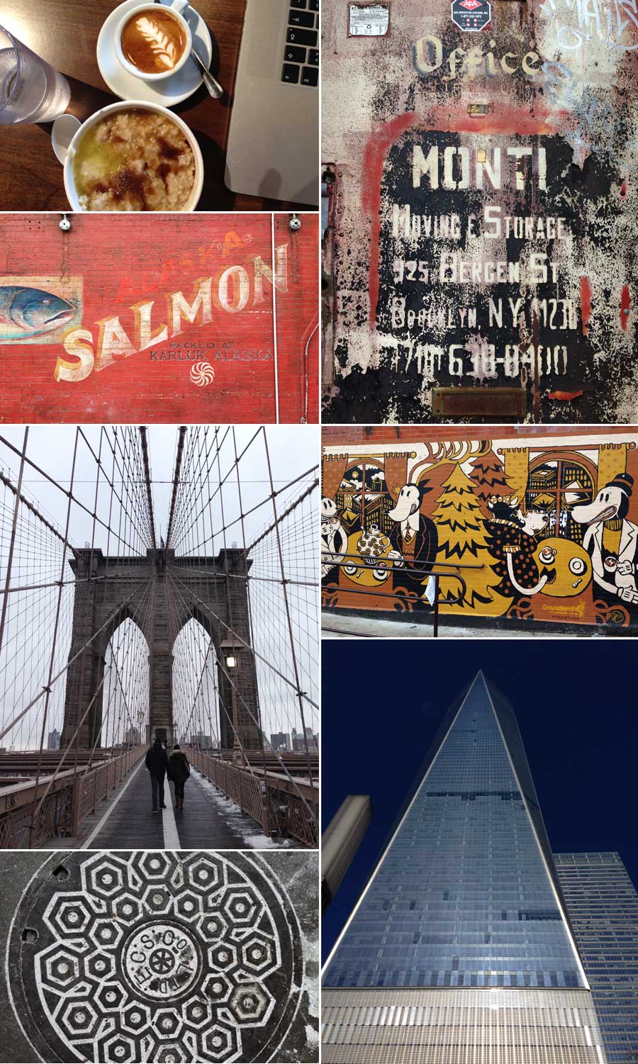
WORK | A new client including two days workshop, resulted that I had to go to Brooklyn, New York. In familiar style I extended the trip with a week where I worked in different places, letting me be inspired by The Big City; wall illustrations, typography, galleries, shops, manholes, people, coffee, food, architecture and everything else New York has to offer.
It was freezing cold, but the coffee and the porridge was warm and delicious.
09.02.2015

WORK | Bror (Brother) is a new restaurant i Trondheim serving juicy, grilled burger, long smoked rib and fresh drinks. The visual identity should appear masculine, so both the expression of the logo and the use of black and white images provide a powerful and rough expression. Webpage implemented by Erik Backer. www.brorbar.no. See more from the Bror identity.
18.01.2015
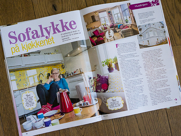
I always try to find something that makes me happy. When I was looking for something that could freshen up my head, I bought a bright yellow wallpaper with colorful birds to have by my kitchen counter. Four pages in Norsk Ukeblad this week where I am interviewed about my great apartment, two sofas in the kitchen, colors and how I work.
Written by Veronika Sørum. Photos by Lena Knutli.
30.12.2014
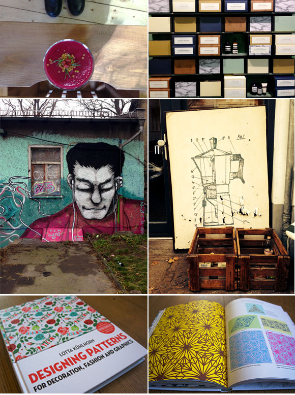
TRAVEL AND INSPIRATION | It´s always a great inspiration to visit Berlin. Even though it was a short trip this time, I brought my Mac and did some work. Otherwise I spent the days to let me inspire by everything Berlin has to offer; shops, wall illustrations, posters, signs, coffee, typography, smoothie, colours, the language and food to mention a few things. I also bought some books, one was Designing patterns by Lotta Kühlhorn, a great and inspiring book about how the author work and design various patterns.
15.12.2014
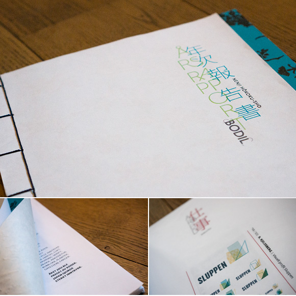
PERSONAL PROJECT | An important part of 2013 was a study trip to Japan. The trip was related to support from The Scandinavia – Japan Sasakawa Foundation, where the gain was to get an insight into Japanese visual communication. The annual report for previous year is therefore characterized by the trip and my experiences with what I observed combined with a course in Japanese bookbinding. I have within the report played and experimented with Japanese and Western typography. What happens when these two merge and we get a brand new expression? To make an annual report every year for my own company is a great way to document all my work and write about my experiences in my own way. I try to challenge myself every year to approach a new theme and a new way of using images and typography.
14.10.2014
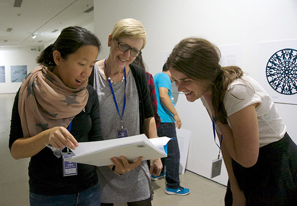
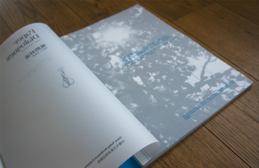
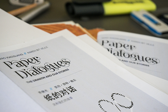
WORK | It was great to finally receive the Paper Dialogues catalogue, 120 pages with both text and beautiful pictures. The author is Marte Rye Bårdsen and the main pictures are taken by Adam Grønne, Cao Liang and Ida Bjørvik. The publisher China Today Art Museum Publishing House has done a wonderful job when they have completed the catalogue along with the printing company Beijing Artron Art Printing. The printing quality is just stunning. The catalogue is for sale in the Today Art Gift Centre. Looking at the catalogue, from the left: Chin-Yu Lee, Bodil Mostad Olsen and Marte Rye Bårdsen. See more from the catalogue and the Paper Dialogues visual identity.
13.10.2014
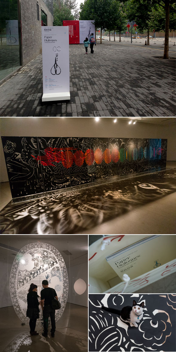
WORK | Three years has passed by since I visited Beijing for first time to have preliminary discussion with the Norwegian embassy and to meet Professor Xiaoguang Qiao regarding a paper-cut exhibition in China in 2014.
After a lot of preparation, including designing a 120 pages catalogue, invitation, folder, poster, boards and wall texts – and an intensive final week for both Scandinavian and Chinese team members – October 1 we could finally open the first Paper Dialogues exhibition. It has become a beautiful an evocative installation in Today Art Museum in Beijing with artists Xiaoguang Qiao and Karen Bit Vejle. The official opening was October 5, a lot of people attended, including the Norwegian Ambassador Svein Sæther. The exhibition will also be shown in Liu Haisu Museum in Shanghai, Vigeland-museet in Oslo and in Nordenfjeldske Kunstindustrimuseum in Trondheim. Read more about Paper Dialogues here.
See more from the catalogue here and the visual identity here.
17.09.2014
WORK | Looking back to my first trip to Beijing in September 2011 where the idea was to establish contacts for a common paper clip exhibition with Karen Bit Vejle and Xiaoguang Qiao, the project is now a reality. After 3 years of continuous work both for the artists and the project group, the first Paper Dialogues exhibition opens at Today Art Museum in Beijing October 1. Furthermore, it goes to Shanghai, Oslo and Trondheim. Besides being part of the project group, I work with the visual appearance of the exhibition; catalog, marketing materials and parts of the exhibition rooms. It has been a challenging job to get Western and Chinese typography to work together, and it has therefore been important to research both Western and Chinese books, typography, images, and paper. All the material is now almost completed and sent to China for finishing. It will be very exciting to come to Beijing in early October for both to attend the exhibition opening and see my own work complete and ready for use.