– a blog about my work, research, ideas, typography and passion for books.
11.05.2017
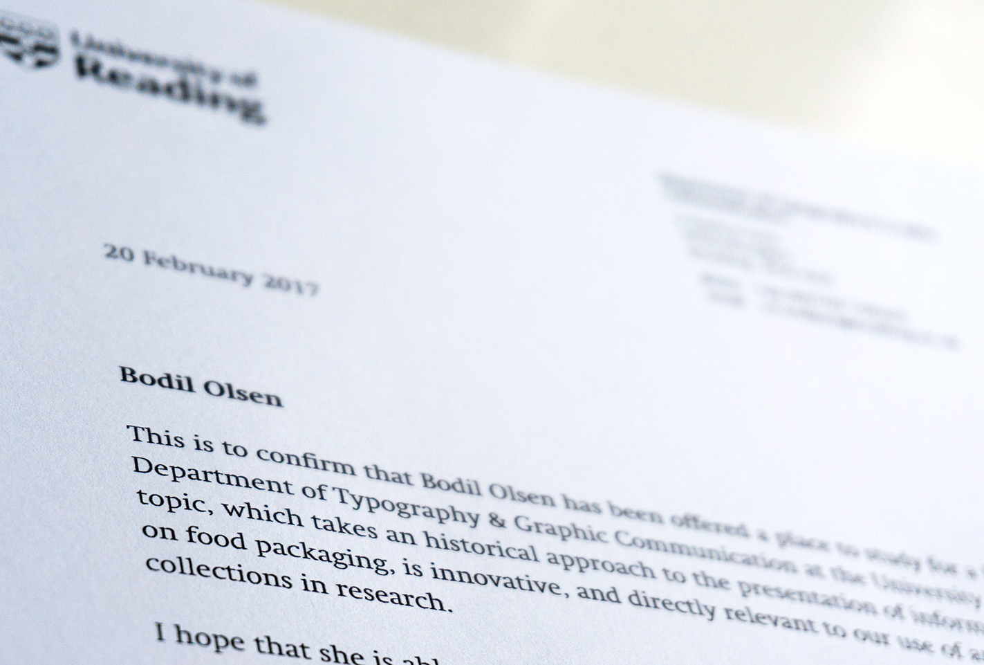
PHD RESEARCH | Sometimes it´s exciting to turn your life upside down, think new thoughts and just do it. My life will change quite dramatically though I have been offered a place to study for a PhD in the Department of Typography & Graphic Communication at the University of Reading from September 2017. Through my research I will look into how the change of food availability and development of human health has affected verbal and pictorial narratives that are relevant to health on front-of-package food labels in Britain from 1850 – 1970. I´m excited, a bit scared and very happy to have been given this possibility.
19.04.2017
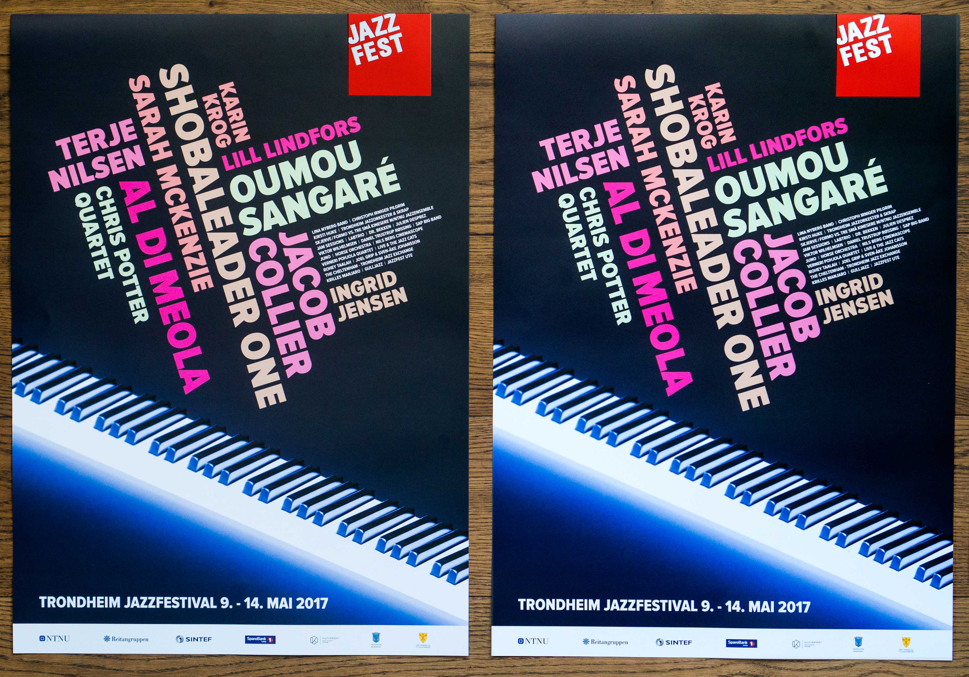
WORK | New identity for Jazzfest 2017. Focusing on typography and playful colors, the visual identity for Jazzfest 2017 has been integrated into this year’s poster, festival program, newspaper and t-shirt. Photographer of this year’s festival motif is Daniel Bolstad, Norwegian School of Photography.
21.01.2017
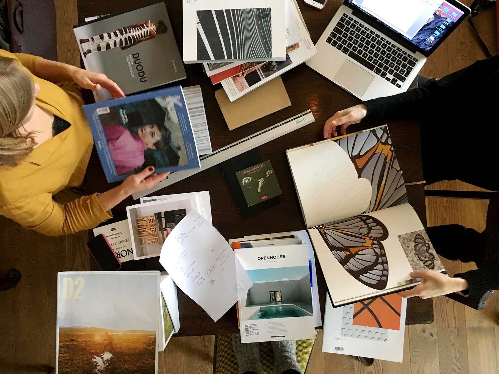
WORK | A new and exciting book project, working with photographer Anne-Line Bakken and author Nina Vennevold. We are in the initial phase researching books and looking for typography, paper, size, colors and patterns…
12.11.2016
WORK | New project for Cirka Teater. They have made its mark with a rich, visual, theatrical language. The repertoire ranges from small, intimate performances to stunning outdoor spectacles and main stage productions. At the moment I am doing research in their own garage to a new brochure about their productions.
12.09.2016
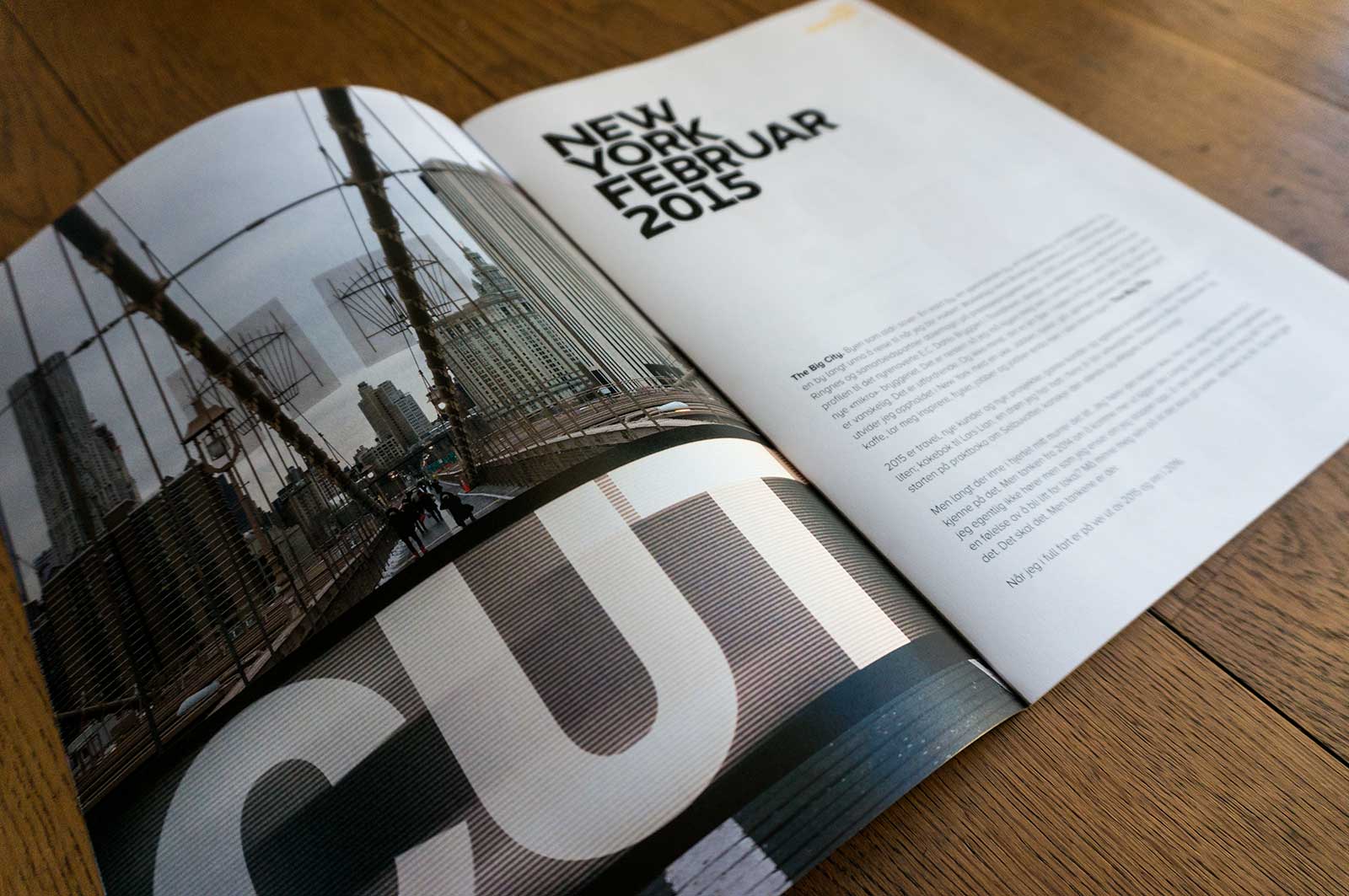
PERSONAL PROJECT | Annual report 2015 for Bodil, my own company. The theme this year is New York, based on my trip to the Big City in connection with a workshop with Brooklyn Brewery, Ringnes and ablemagic regarding development of the visual identity for E.C. Dahls Brewery. Otherwise the report consists all my work done in 2015, travels and all the exciting numbers…
15.08.2016
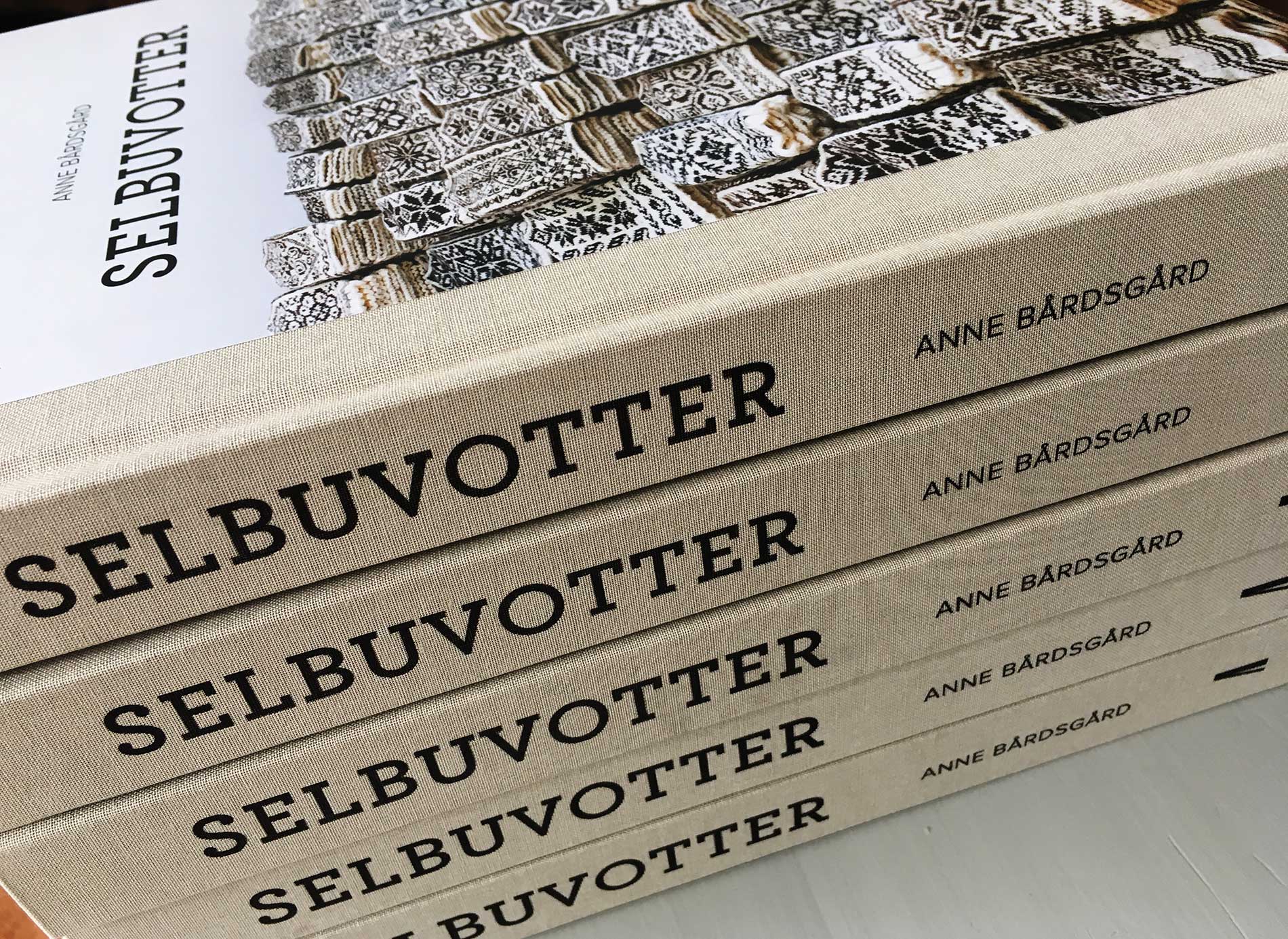
WORK | I´m excited every time I receive a book directly from the printing company. The book Selbuvotter about mittens from Selbu arrived last week and was launched yesterday in Selbu together with the author Anne Bårdsgård, all the knitters who had contributed, friends and rest of the project group. It has become a great book and has received very good criticism from many parts. See more from the book Selbuvotter.
11.07.2016
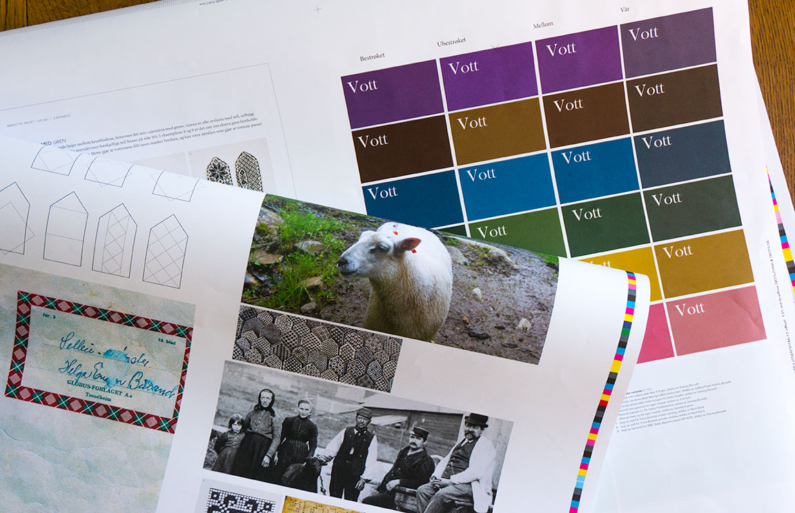
WORK | One year has passed since the author Anne Bårdsgård an I started the preparations. The book about Selbu mittens is now designed and almost ready to be sent to print. We are working to ensure that the colors, images and thickness of the pattern lines are good before final documents are submitted. The book is expected to arrive in August.
11.06.2016
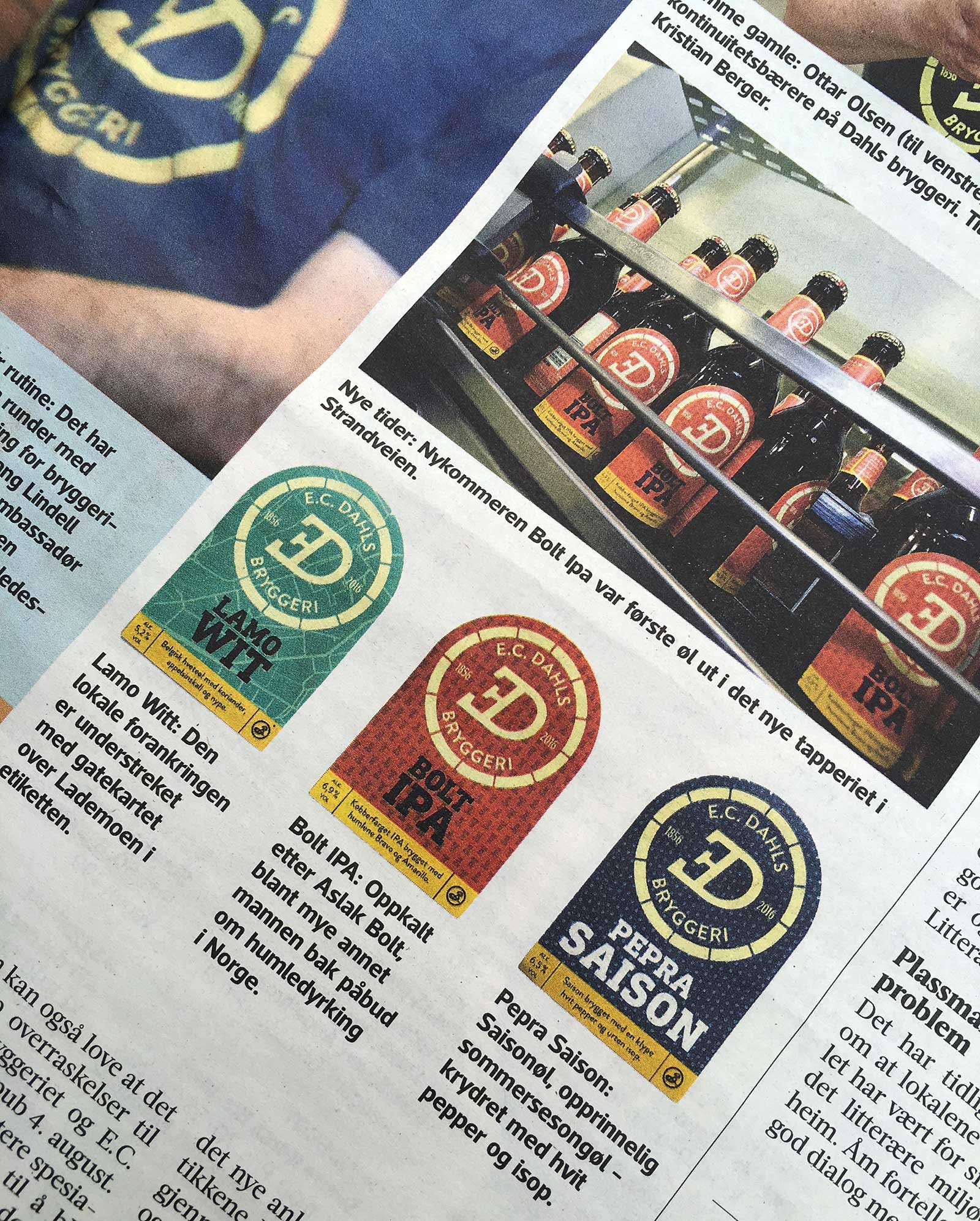
WORK | The packaging design for E.C Dahls Bryggeri is finished and the labels are placed on the bottles. Adresseavisen writes about the new identity and the new beer which will be available to buy in August. Excited. See more from the E.C. Dahls Bryggeri identity.
04.06.2016
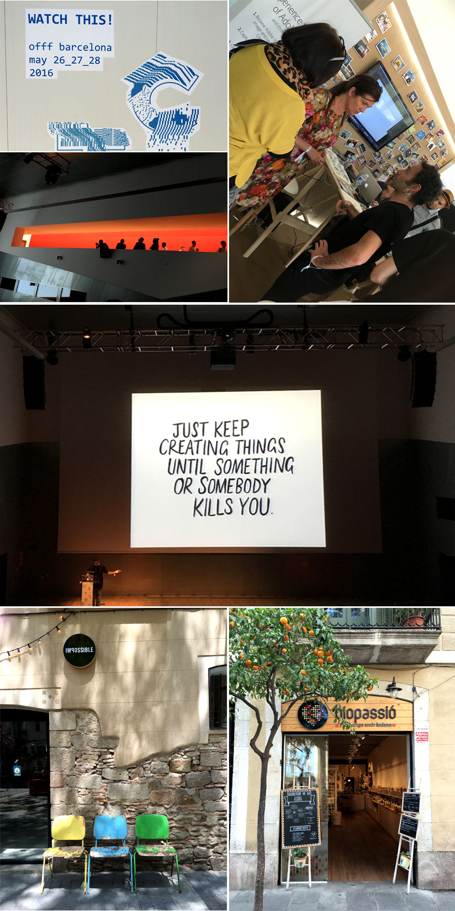
TRAVEL AND INSPIRATION | OFFF takes place in Barcelona annually and is inviting all those who are eager to learn to participate and get inspired in a three-day journey of conferences, workshops, activities and performances. It’s a combination of Offline/Online designers, Motion Designers, Thinkers, Sound Designers, Graphic Designers, Theorists, Developers, Professionals, Students… Putting the titles aside, OFFF is made for the curious.
Together with author Gunn Merete Roll and graphic designer Kirsten Stangvik I went to the OFFF festival in Barcelona in May to get three days of inspiration. Barcelona itself is fantastic and also very inspiring; Ten days looking at outstanding architecture, signs, typography, colors, the beach, tasting good coffee and food – just to mention something.
30.05.2016
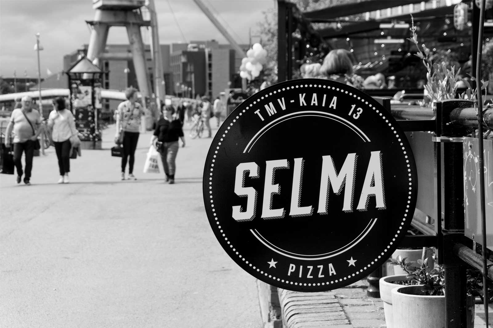
WORK | Just finished the identity for a new pizza restaurant in Trondheim. Selma offers pizzas made of organic ingredients and natural sourdough culture from Morten Schakenda and his bakery in Lom. They are baked in a genuine way in a wood fired oven. See more from the Selma identity.