I’m Bodil, a book and identity designer from Trondheim, Norway, holding a PhD in Typography & Graphic Communication from the University of Reading. My research interest concentrates on the verbal and visual presentation of health messages on food labels dating from 1850 to 1970. Please read my blog and have a look at my work. Feel free to get in touch if you think there is something I can do for you. Get in touch ›
– a blog about my work, research, ideas, typography and passion for books.
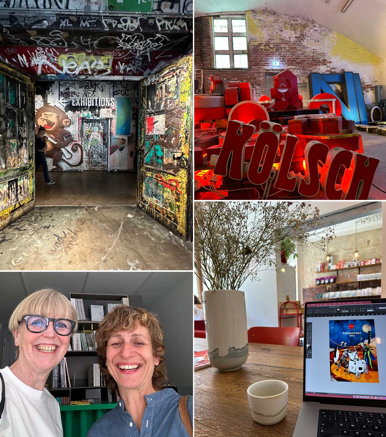
TRAVEL, WORK AND INSPIRATION | Ten days in Berlin bringing my design work from home, writing an application for a new project, visiting Fotografiska Berlin, The Buchstabenmuseum, drinking brilliant coffee, and buying too many books. A fantastic trip meeting a lot of interesting people, among them the inspiring and talented Anja Lutz. Anja is an art book designer and a co-founder of the publishing company The Green Box. She has also founded A–Z, a space in Mitte Berlin for experimental graphic design.
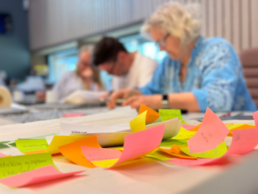
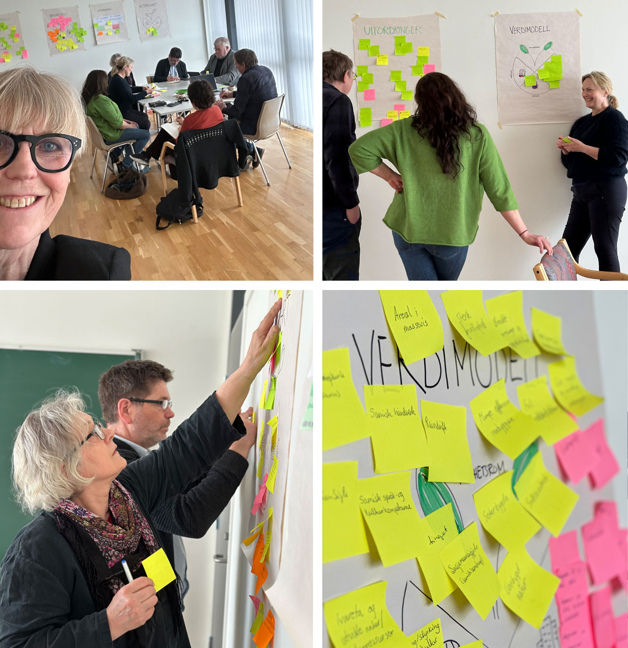
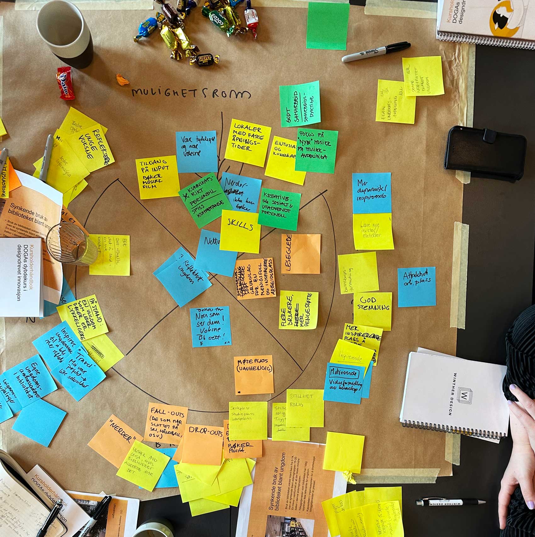
I have today completed DOGA’s 6-module deep dive course in design-driven innovation in Snåsa. The group has defined challenges and values, prepared user interviews, and visualised ideas. Thanks for an intensive, fun, and educational process over four weeks.
WORK | I recently had the opportunity to lead the first part of a 6-module design-driven innovation course in Snåsa. The course is grounded in the municipality’s strategic plan, which aims for Snåsa to have more residents, a more balanced age distribution, and jobs for all by 2032. To achieve this goal, the municipality must address a series of challenges. The session blended theory and practice, allowing participants to define key challenges, values and effectively conduct user interviews.
The session was a remarkable journey, and I appreciate everyone who participated for their enthusiasm and commitment to the process. I’m looking forward to continuing the course in two weeks, where we will explore a multitude of ideas and plan how to implement them.
WORK | I am now offering a deep dive course in design-driven innovation in collaboration with DOGA. Design-driven innovation is a systematic process for solving a challenge and is for anyone interested in exploring new ways of working with innovation and transformation. In this course, you will learn a method that will help you and your colleagues think differently and change the way you develop products or services. You will work on solving a real challenge from your own organisation. After the course, you will have a user-tested solution proposal and a plan for how to implement it. The course spans 6 modules, each lasting 3.5 hours. The course is developed by DOGA Design og arkitektur Norge.
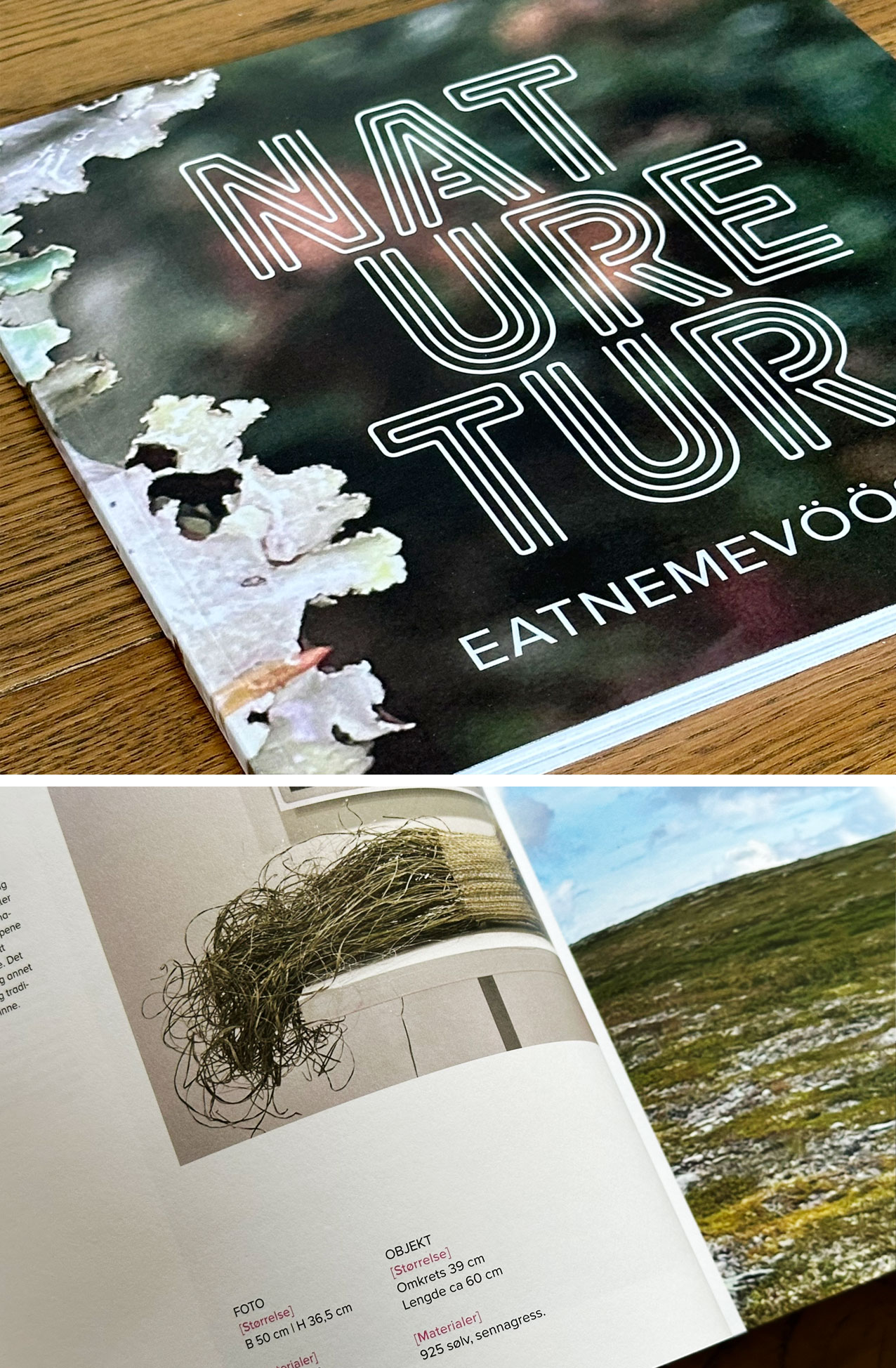
WORK | Naturetur is an upcoming exhibition set to debut at Sverresborg, Trøndelag Folkemuseum on February 24, 2024. This innovative showcase blends tradition with contemporary perspectives, offering a captivating exploration of nature’s abundance. Drawing inspiration from the rich heritage of utilising natural materials in Norwegian craftsmanship, Naturetur honours this age-old practice while highlighting the modern imperative to nurture and protect our environment. Through a curated collection of artworks by 17 artists, the exhibition explores the intricate relationship between humans and nature.
As the designer entrusted with crafting the visual communication for this project, I have had the privilege of creating a series of visually striking pieces designed to invite, captivate and inspire audiences. See more from the book here.
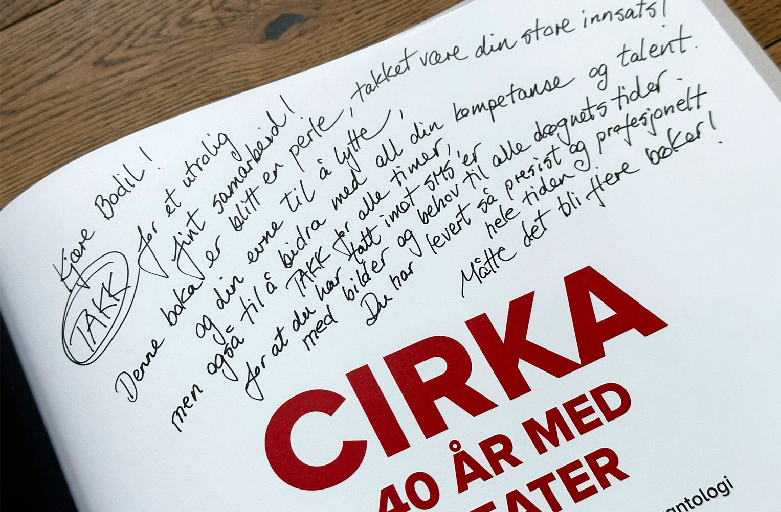
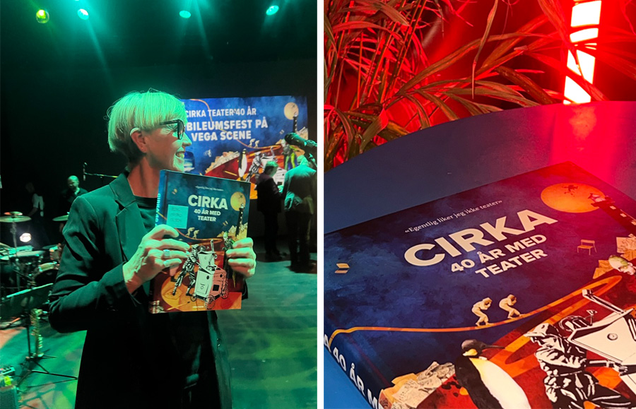
WORK | At the recent launch of the Cirka Teater jubilee book, I was deeply touched by a heartfelt message from Anne Marit and Gilles. In their note, they expressed sincere gratitude for our collaboration and my constant support, professionalism, and dedication throughout the process. See the book here.
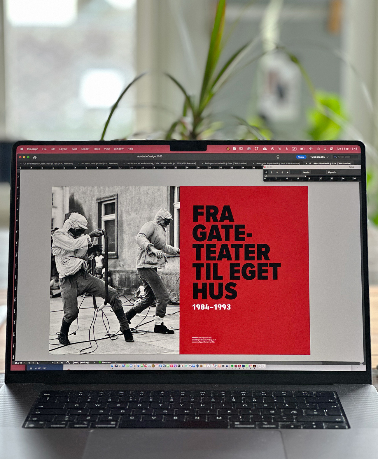
WORK | The 300-page jubilee book for Cirka Teater is printed and was launched at Vega Scene on October 14. Through interviews, pictures, and music, the story of Cirka Teater was shared. The book is a combination of Cirka Teater’s «autobiography,» authored by Anne Marit Sæther, and an anthology featuring articles by theater directors, actors, musicians, critics, producers, and organisers. I have designed the book which is enriched with anecdotes and illustrated with over four hundred photographs and drawings. See more from the book here.
Anne Marit Sæther and Gilles Berger started Cirka Teater in Trondheim in 1984. Over the course of forty years and numerous productions, they have crafted their own artistic expression, encompassing large, spectacular outdoor events, playful fables, and poetic narratives.
WORK | Cirka Teater is celebrating 40 years of theater, and I had the honor of creating the anniversary book. It is currently in development and will be an autobiography written by Anne Marit Sæther, in addition to an anthology featuring articles by theater directors, actors, directors, musicians, producers, and organizers. The book will be enriched with anecdotes and illustrated with over 400 photographs and drawings. In September, 300 pages will go to print.
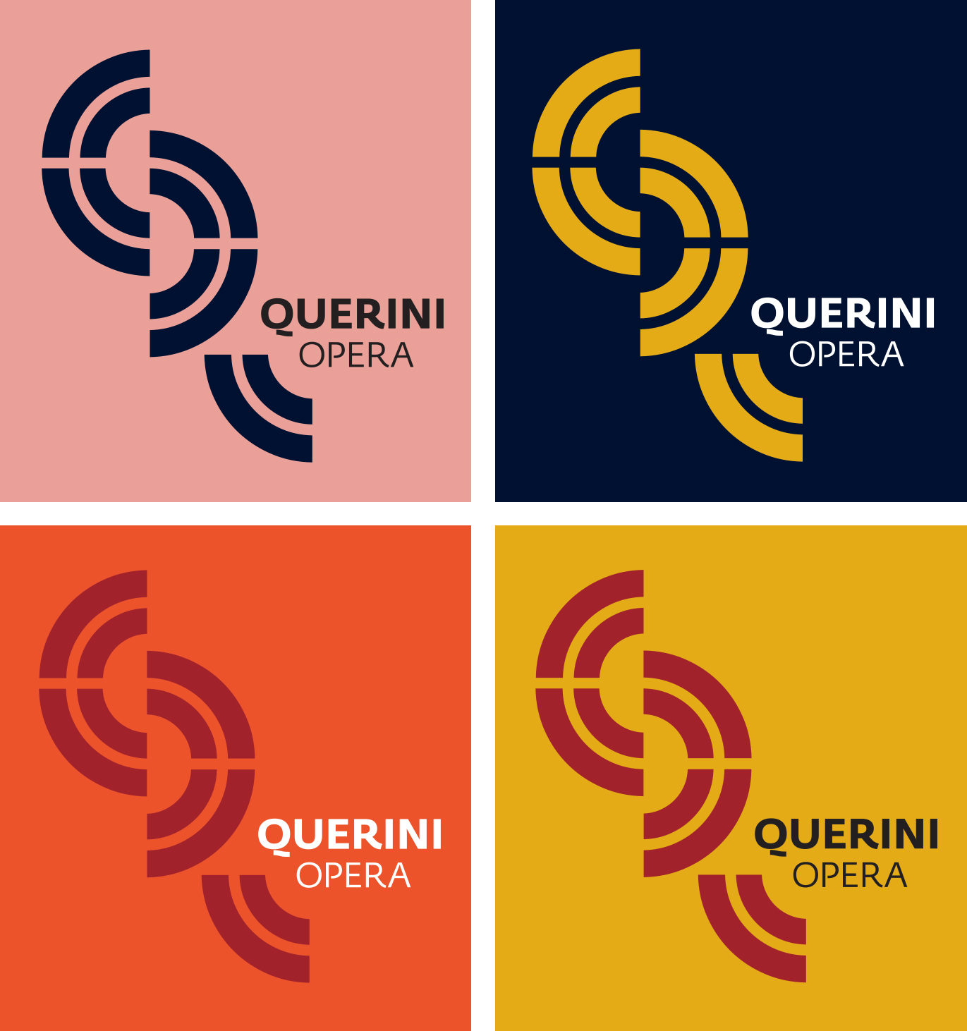
WORK | Pietro Querini, a 15th-century sailing captain from Venice, was shipwrecked at Røst during the winter of 1432. The plot of the Querini opera centres around the stark contrast between the modest living conditions of northern Norway and the opulent lifestyle of Venice.
The visual identity of the opera captures these contrasts through the use of colours, typography, imagery, and proportions. You can see more of the opera’s visual identity here.
WORK | In 2022, the year was primarily characterized by the completion of my doctoral degree, the Viva voce examination, minor adjustments, submission, and graduation. However, my life as a book and identity designer is gradually starting to mirror the annual report.