– a blog about my work, research, ideas, typography and passion for books.
18.02.2014
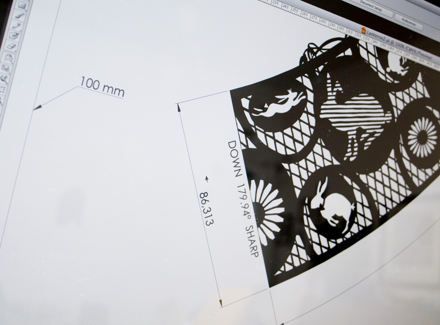
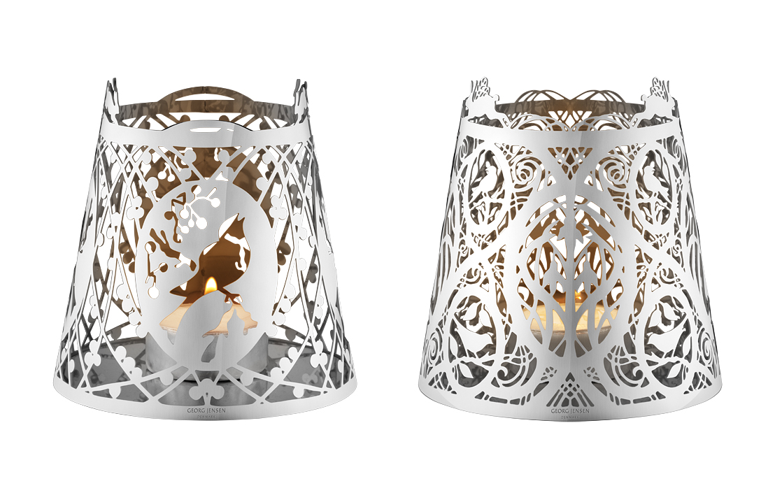
WORK | With extreme accuracy I have converted Karen Bit Vejle’s beautiful paper cut art to correct originals. 6 products are manufactured in polished stainless steel for Georg Jensen’s easter collection 2014, A bit of easter.
Karen Bit Vejles form of expression, psaligraphy, literally means the art of drawing or painting with scissors. Her magical cuttings in the travelling exhibition Scissors for a Brush, are rooted in a tradition that has known a long journey through history. But she has created a personal style and technique that are entirely her own. For more than 35 years she has been absorbed, fascinated, and deeply committed to this art form that developed from small, simple snowflakes to unusually large and highly complex image cuttings. She is one of very few in Europe who can cut at such an advanced technical and artistic level. There is a great degree of humour in Karen Bit Vejle’s world of imagery; humour and the ability to identify joy in small things. Just as often, though, she confronts deep seriousness and themes intended to invoke involvement and reflection. Her works are captivating surprise packages. By meeting Karen Bit Vejle’s images of air and paper we can find ourselves both surprised and inspired! (Text about Bit: www.georgjensen.com/europe/designer/karen-bit-vejle/) See more from Bit, or browse her own website.
28.01.2014
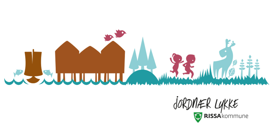
WORK | A new identity for Rissa is developed. The main idea is to show that Rissa is an active municipality – and a good place to stay. The work is a collaboration with Ingrid Baadnes from ablemagic. Colours, typography and design elements are based on strong values; engaged, lush and welcoming, and the aim has been to show an overall impression based on nature, experiences, participation, diversity and proximity to the sea. See more from Rissa here.
27.10.2013
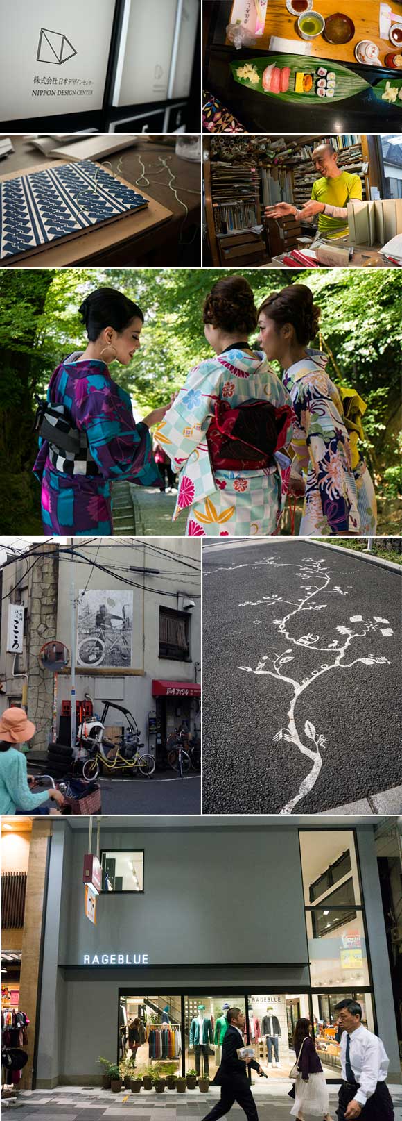
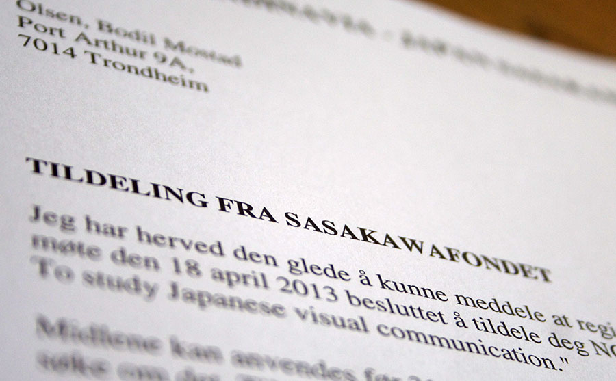
PERSONAL PROJECT, WORK | The starting point for my trip to Japan related to the support from The Scandinavia – Japan Sasakawa Foundation, was to gain an insight into Japanese visual communication.
I visited both Tokyo and Kyoto and documented in the first place the Japanese visual language using the camera. I started wide with many different directions; architecture, pattern, manhole covers, signs, clothing, food, stores, packaging design and posters. The result has been nearly 1000 images. In addition, I visited various galleries, and had specifically benefit from an exhibition at the Ginza Graphic Gallery, where the award-winning graphic designer Rikako Nagashima showed various works. In addition, I worked on making contacts. I had a meeting with the Art Director Kaoru Matsuno at Hara Design Institute/Nippon Design Center. She works closely with Kenya Hara who is also the Art Director for Muji. In addition, I worked two days with Mr. Yamamzaki Yo, where I was trained in ancient Japanese bookbinding techniques. Mr. Yamazaki Yo is a renowned bookbinder in Tokyo.
Given the goal of the trip, it’s been an interesting journey. With the imagery I now hold, it will be interesting to go more in depth of Japanese design in order to relate it to Western design. The contact with Mr. Yamazaki Yo gave me not only a concrete introduction into Japanese bookbinding techniques, but there was also a fundamental insight into the Japanese way of life, aesthetics and accuracy. Kaoru Matsuno gave an insight into how Hara Design Institute works in various design processes.
The journey and the process has given me inspiration to convey impressions through both lectures and a book. The lectures are intended as a process description based on the experiences I have gained. The idea about the book is to create inspiration for both Japanese and Western designers.
An alternative, or as an addition, it is also possible to think of an exhibition. I have been in contact with Hagiso, a small, newly renovated Japanese house in Yanaka, north of Tokyo, that is a venue for art and other events. They are open to offer an exhibition space for the project. The idea of the exhibition is to introduce Japanese and Western design in a possible artistic context with the book and the bookbinding techniques as a starting point.
22.10.2013
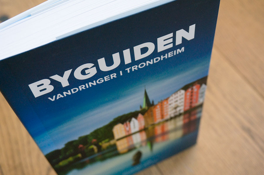
WORK | A new book has been designed and printed. The book is a tool to explore Trondheim. 26 themed walks are accompanied by maps and tips on places to stop. It has been an exciting and extensive process, both finding good typography and to allocate a lot of text and photographs on a comparatively small size. Using the font Proxima Nova and a distinct color palette that structures the chapters, makes the book readable and clear. The book is published by Museumsforlaget. See more from the book here.
15.09.2013
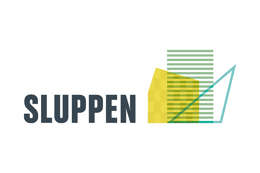
WORK | Sluppen is a district in Trondheim. The identity is developed to show a city in transition. The idea is to show that the site is constantly evolving, things are changing, new architectural forms emerge, rooms open and close. I have developed a symbol inspired by the new buildings in the area. To emphasize the continuous change, the logo consists of about 28 different symbols that are almost equal but at the same time different. Colors are selected on the basis that the area has a clear environmental profile. See more from Sluppen here.
20.06.2013
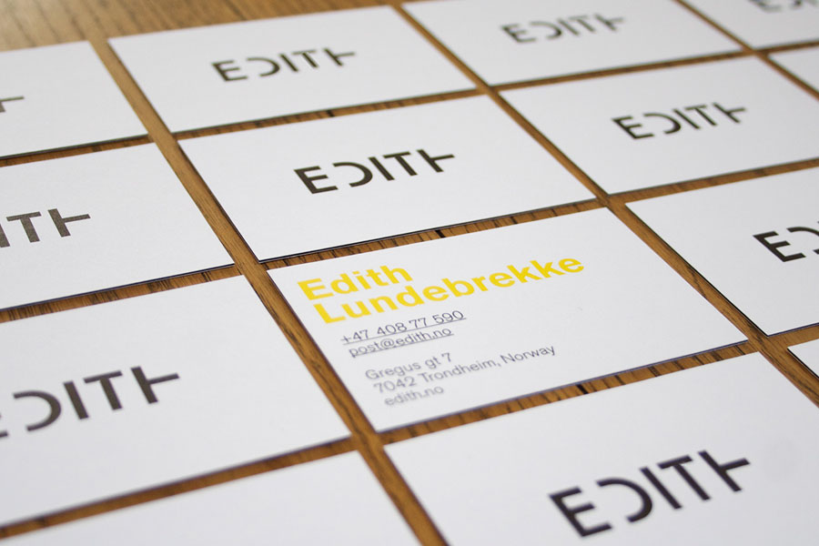
WORK | Inspired by the quote from Dick Bruna: “If you put a very few things on the page, you leave lots of room for the imagination” the new visual identity for Edith was developed. Edith Lundebrekke is a visual artist and works with art and architectural installations. Her work is based on the repetition of simple geometric shapes. She has received particular attention for her works with wooden reliefs, where the experience of colour and shape changes according to the spectator’s movement. The identity developed is based on simplicity and how to challenge the viewer. There has been no desire to recreate something of her art in profile, but rather develop a strong logo with typography and colors which become elements in a clear and strong profile. The work is a collaboration with web designer Eirik Backer, www.kirie.no. See more from EDITH here.
05.05.2013
WORK, PERSONAL PROJECTS | Having just received wonderful news; I have been granted a scholarship from The Scandinavia – Japan Sasakawa foundation in connection with a new and exciting project that is under development. In October I will go to Japan where the purpose of the journey is to get an insight into Japanese visual communication seen through western eyes. Exploring the differences and similarities with focus on crossing points. In addition I will learn Japanese bookbinding from Mr. Yo Yamazaki who is a Japanese bookbinder in Tokyo.
The tour will provide a basis to give lectures to students in Scandinavia and possibly Japan, where I can pass on impressions and give an analytical representation of differences and similarities.
There’s more to come.
04.03.2013

WORK | IMELLA is an adventure route in South Troms, north of Norway. The new identity created is based on the specific nature of South Troms, where mountains and sea form a clear and simple symbol. The mountains overlap, which creates new forms and colors and illustrate diversity in experiences and nature. The typography is strong and clear and will thus be suited very well on signs. The typography has also received a unaffected expression, which reflects both the nature of the southern Troms and the values for IMELLA. It is chosen a color palette with an emphasis on nature in southern Troms. 3 main colors illustrate stones, forest and blue mountains. In addition, it is selected 7 additional colors illustrating details in nature such as heather, grass, sky and sun. All the colors together give the profile a clear and consistent picture of IMELLA. See more from IMELLA here.
The development of the identity is a collaboration with illustrator Ingrid Baadnes in ablemagic.
20.02.2013
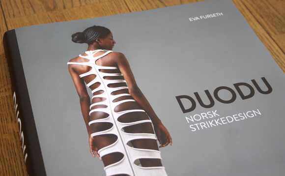
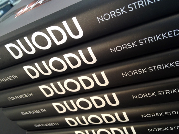
WORK | Direct from the printing company Livonia Print in Latvia the DUODU book just arrived. Excited and happy we flicked through the book and found that the quality of the print, chosen paper and the design looks great. The publisher is Forlaget Schrøder. See more from the DUODU book here.
17.02.2013
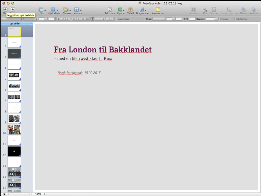
WORK | I was invited to give a lecture for the students of Art Photography at Norsk Fotofagskole, The Norwegian Photography School last Friday. The lecture was titled: From London to Bakklandet – with a slight detour to China. The main theme was to talk about books, typography and identity. However, I talked them through a journey, from my time in London graduating from London College of Communication to the present day, where I work in my own design studio at Bakklandet in Trondheim. I talked about several projects, typography, how I let myself be inspired by books, movies and traveling to different cities in the world, my own work, and how I create my own projects; one of them related to China and a possible exhibition/book. My focus was also to show how identity and personality always can be related to typography and books. I had a great time and the students were responsive and interested.