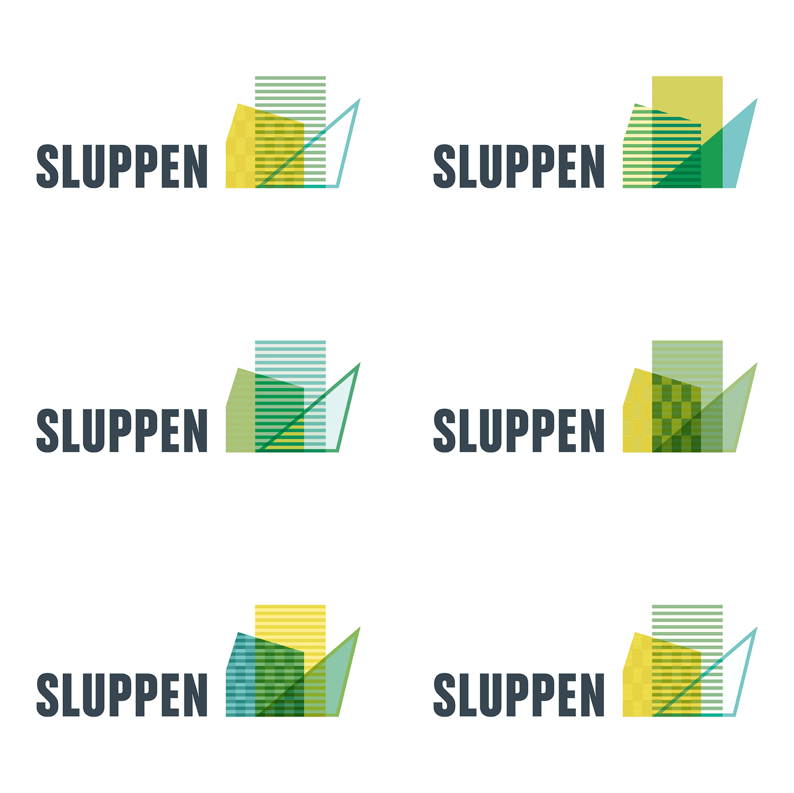
VISUAL IDENTITY FOR SLUPPEN
15.09.2013WORK | Sluppen is a district in Trondheim. The identity is developed to show a city in transition. The idea is to show that the site is constantly evolving, things are changing, new architectural forms emerge, rooms open and close. I have developed a symbol inspired by the new buildings in the area. To emphasize the continuous change, the logo consists of about 28 different symbols that are almost equal but at the same time different. Colors are selected on the basis that the area has a clear environmental profile. See more from Sluppen here.

