

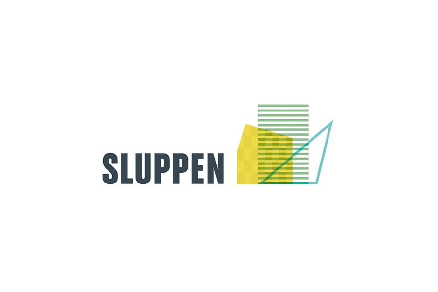
SLUPPEN
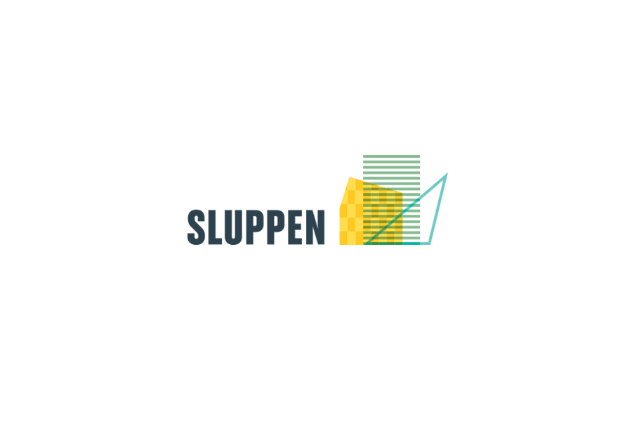
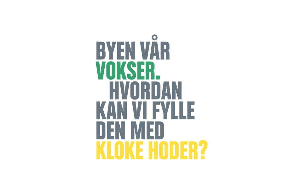
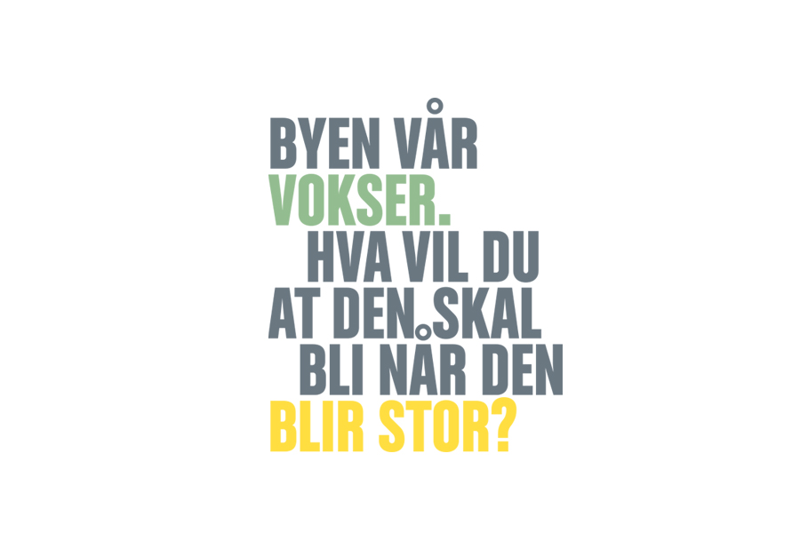
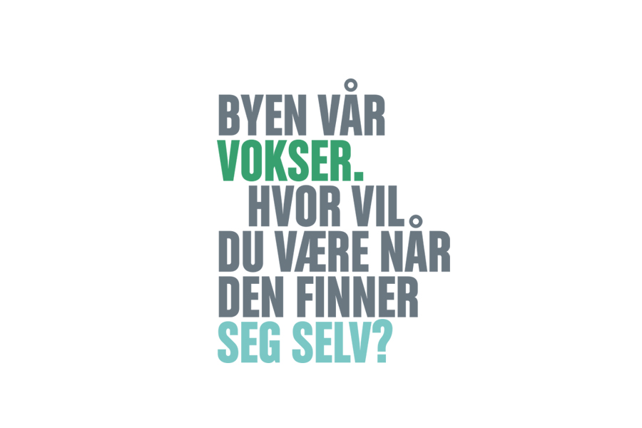
Sluppen is a district in Trondheim characterised by its constant evolution and emergence of new architectural forms. The identity aims to capture this dynamic nature. I have developed a logo inspired by the contemporary buildings in the area. To underscore the theme of change, the logo consists of 28 different variations. The colour palette reflects the district’s environmental profile.
SLUPPEN
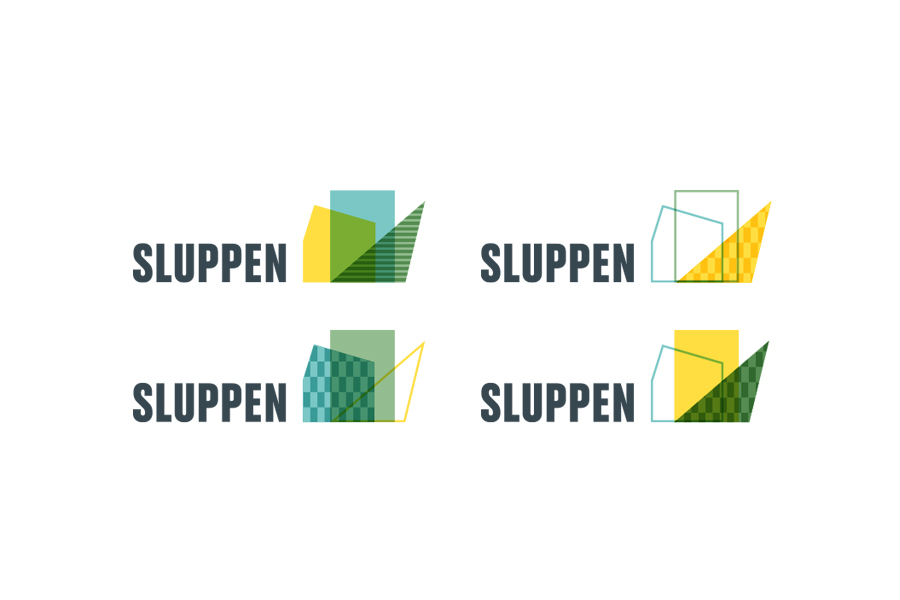
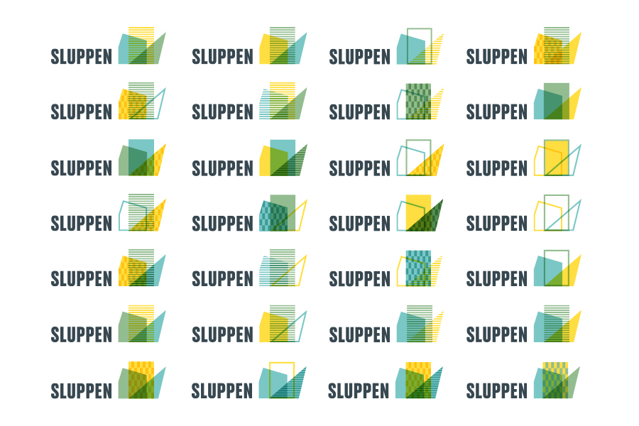
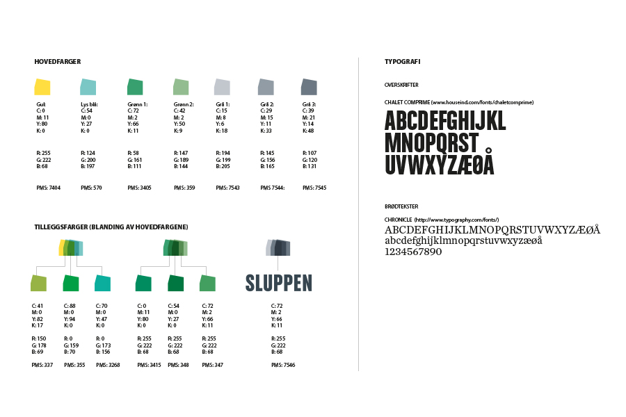
Sluppen is a district in Trondheim characterised by its constant evolution and emergence of new architectural forms. The identity aims to capture this dynamic nature. I have developed a logo inspired by the contemporary buildings in the area. To underscore the theme of change, the logo consists of 28 different variations. The colour palette reflects the district’s environmental profile.