A space for my work, research, ideas, typography, and passion for books.
12.11.2016

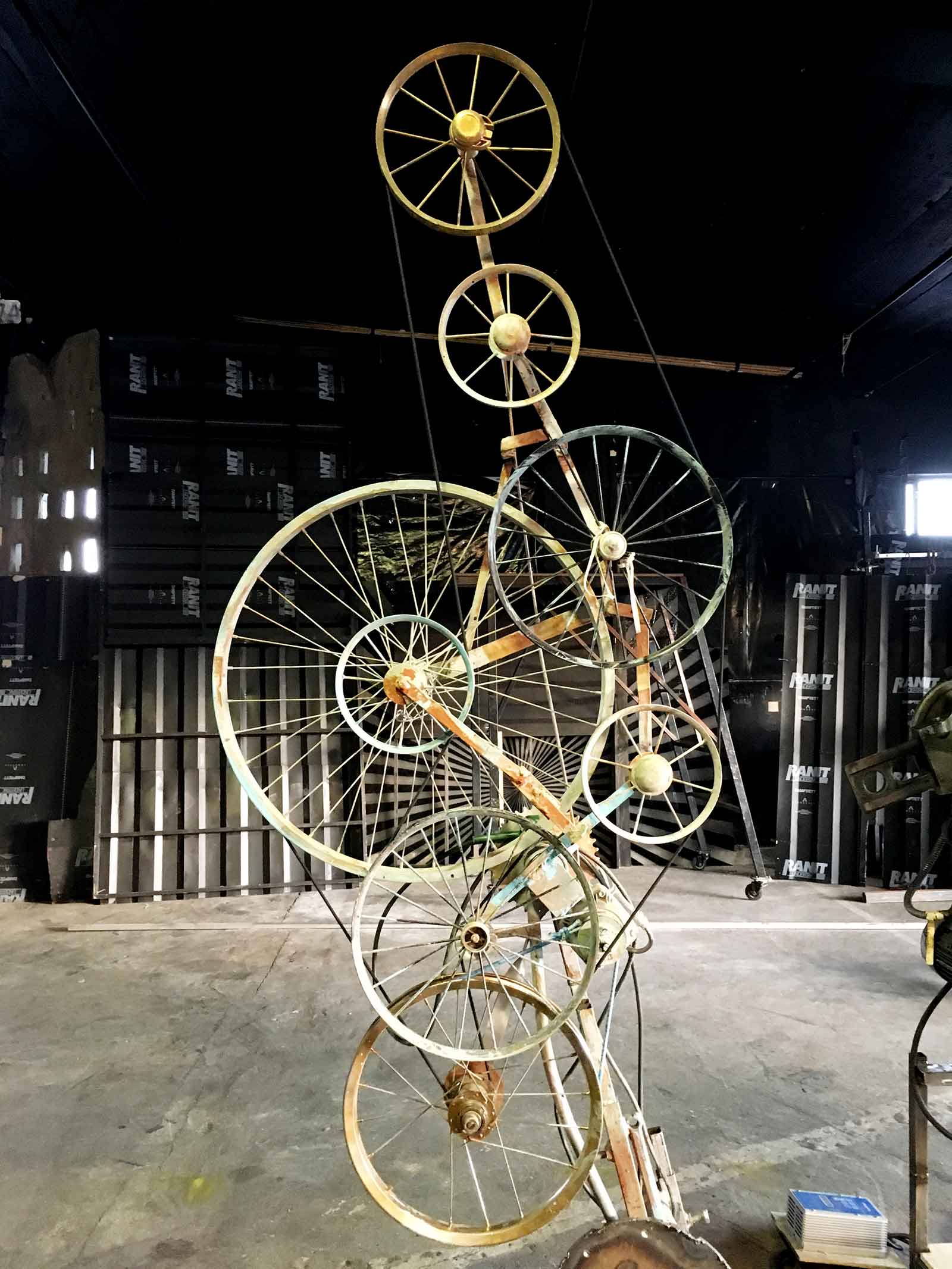
WORK | New project for Cirka Teater. They have made its mark with a rich, visual, theatrical language. The repertoire ranges from small, intimate performances to stunning outdoor spectacles and main stage productions. At the moment I am doing research in their own garage to a new brochure about their productions.
15.08.2016

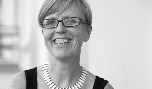
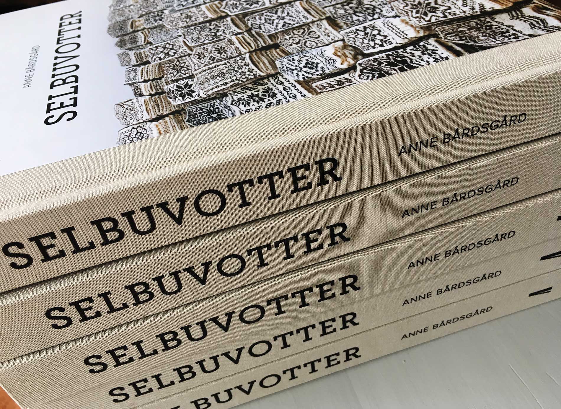
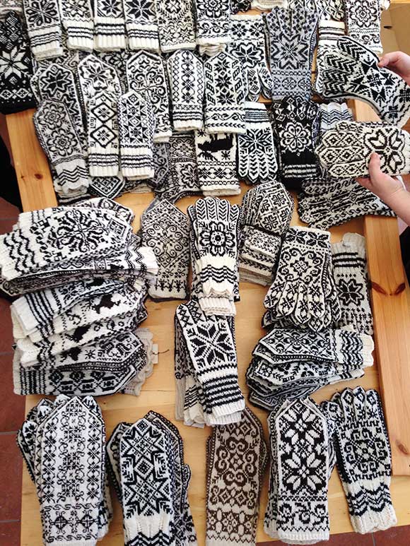
WORK | I´m excited every time I receive a book directly from the printing company. The book Selbuvotter about mittens from Selbu arrived last week and was launched yesterday in Selbu together with the author Anne Bårdsgård, all the knitters who had contributed, friends and rest of the project group. It has become a great book and has received very good criticism from many parts. See more from the book Selbuvotter.
11.07.2016

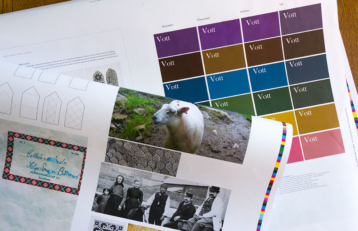
WORK | One year has passed since the author Anne Bårdsgård an I started the preparations. The book about Selbu mittens is now designed and almost ready to be sent to print. We are working to ensure that the colors, images and thickness of the pattern lines are good before final documents are submitted. The book is expected to arrive in August.
11.06.2016

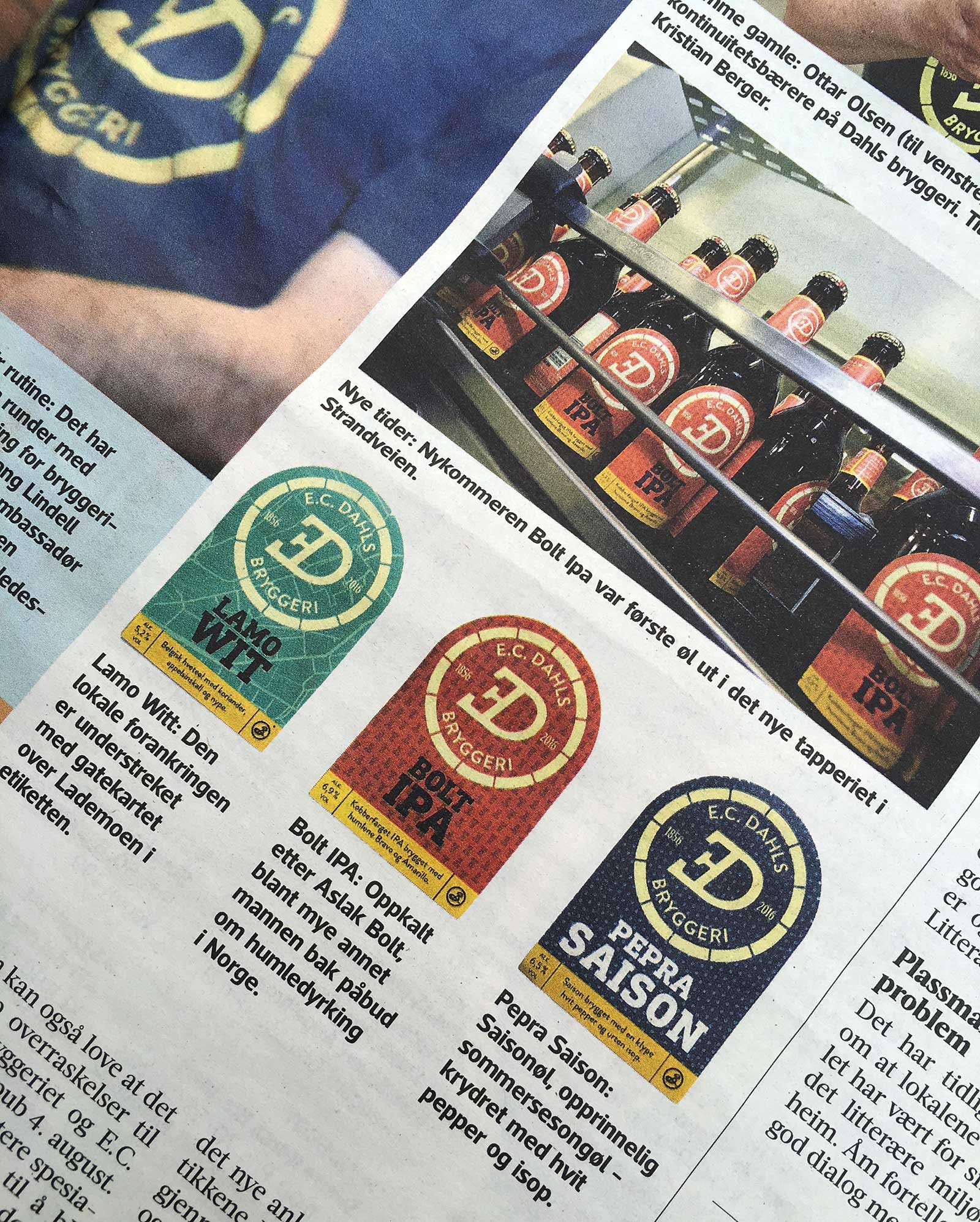
WORK | The packaging design for E.C Dahls Bryggeri is finished and the labels are placed on the bottles. Adresseavisen writes about the new identity and the new beer which will be available to buy in August. Excited. See more from the E.C. Dahls Bryggeri identity.
30.05.2016

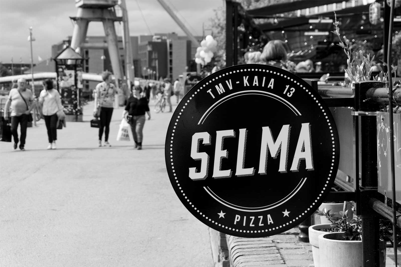
WORK | Just finished the identity for a new pizza restaurant in Trondheim. Selma offers pizzas made of organic ingredients and natural sourdough culture from Morten Schakenda and his bakery in Lom. They are baked in a genuine way in a wood fired oven. See more from the Selma identity.
03.05.2016

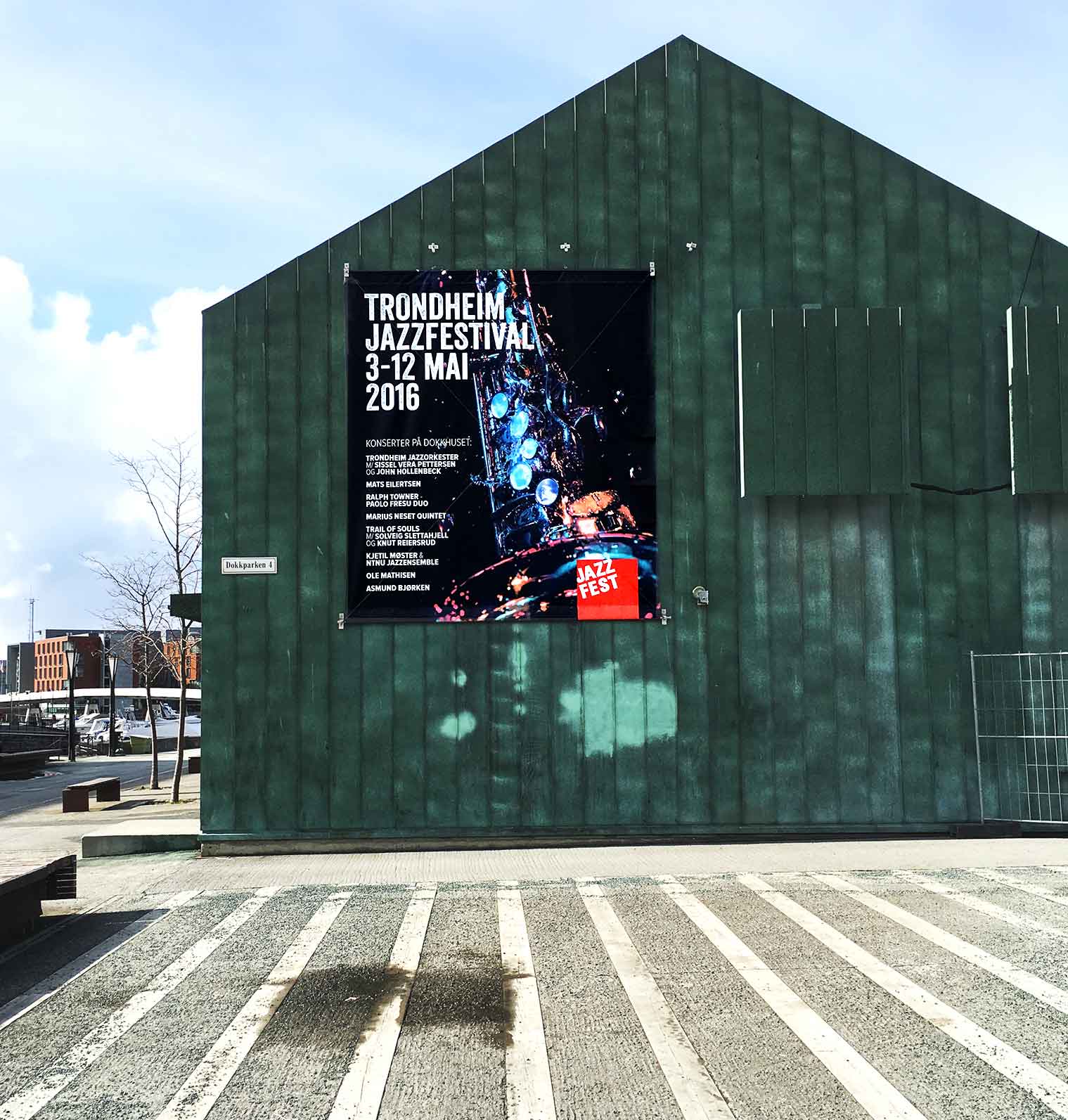
WORK | I worked with Jazzfest from 2005 – 2009; developed the identity and created the marketing material. Now the client is back, and I have worked with this year’s festival newspaper, program, poster and t-shirt. Very nice to work with “old” customers again.
The photographer behind the festival illustration is Ingvild Katrine Lines, student at Norsk Fotofagskole in Trondheim
06.04.2016

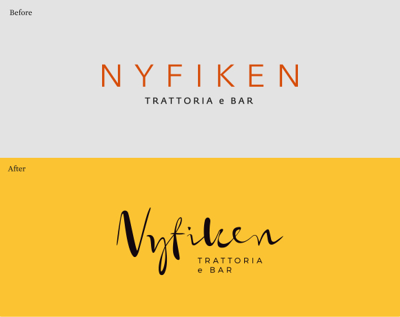
WORK | Nyfiken is a restaurant in Trondheim serving Italian food. The task was to rebrand the identity to give the guests a stronger feeling of a taste of Italy through new logo, color palette and typography. The new logo is hand-drawn and gives a personal and warm expression that welcomes the guests. See more from the Nyfiken identity.
17.02.2016

WORK | Together with the author Anne Bårdsgård I am designing a new, large book about Selbu mittens. Anne has worked on the material of this book for three years. She has been keen to find and register as many old pattern as possible. In addition, it has been important to find as much knowledge as possible about knitting mittens to create an overview of procedures. The book will contain history and characteristics of a mitten from Selbu, how to knit together with various patterns. Anne has also made an exhibition related to Selbu mittens.
05.12.2015

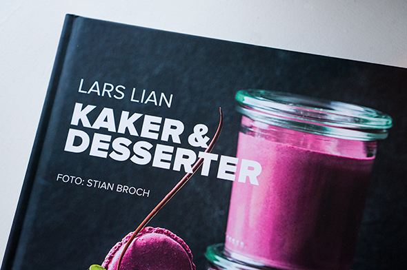
WORK | In collaboration with photographer Stian Broch this has become a great book with wonderful pictures and exciting recipes. The book has received a clean design that suits the images and makes the book very attractive and delicate.
Lars Lian is a well known pastry chef in Norway with many years experience as a TV chef, food writer and author of several cookbooks. Stian is a commercial photographer from Norway. His main area is food-photography. stianbroch.com. See more from the book.
19.10.2015

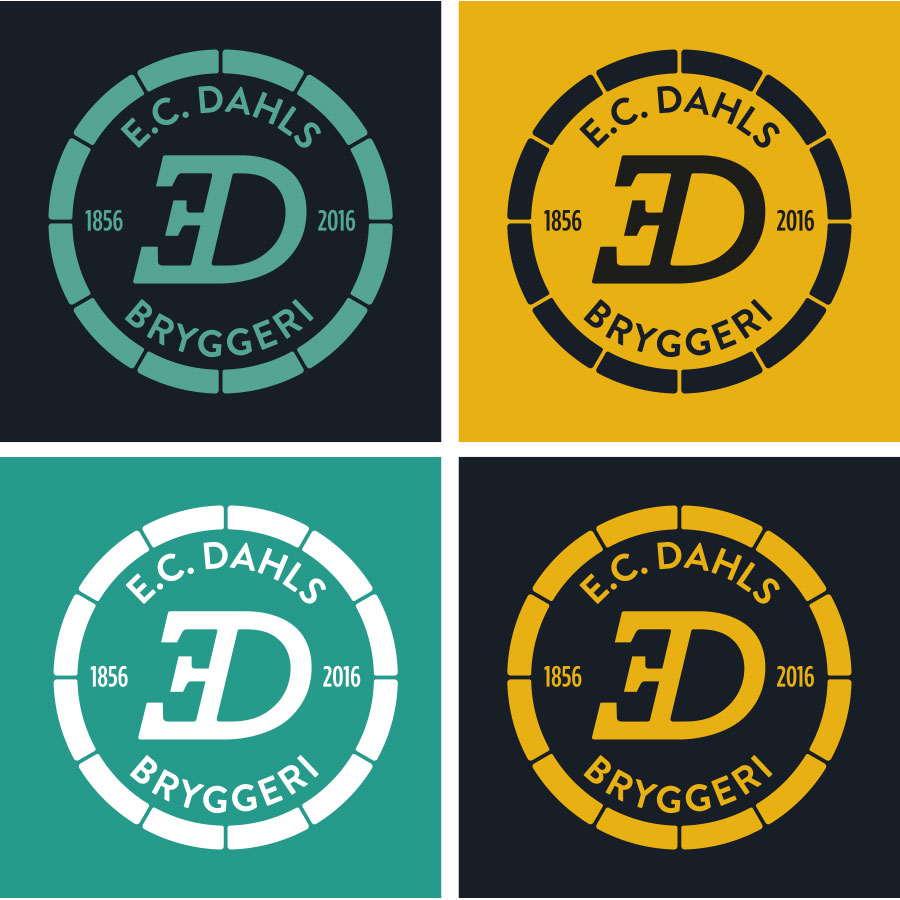
WORK | In cooperation with Ingrid Baadnes and Nina Fjelnset from ablemagic we have worked with the new identity for E.C. Dahls Bryggeri in Trondheim. E.C. Dahls Bryggeri was founded in 1856, and in 2015 a collaboration between E.C. Dahls Bryggeri and the renowned Brooklyn Brewery, New York started. The brewery will reopen late summer 2016 with a restaurant and a pub, in addition to that the brewery will produce both popular local Dahls beer, as well as new craft beers that take inspiration from both Norwegian and US craft brewing traditions.
We have worked closely with Ringnes and the people from Brooklyn Brewery when developing the identity for the brewery. The logo of E.C. Dahls Bryggeri is a new, modernized version of the old E.C. Dahls Bryggeri logo; the inverted, italic E. This creates a high level of recognition. It is built on tradition, but the simplification creates a more modern expression. The brewery opens its gates to the public. The symbol is not within a closed circle, but an open one, that might give associations to a classic beer barrel. See more from the visual identity.
