– a blog about my work, research, ideas, typography and passion for books.
15.09.2013
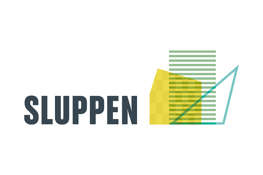
WORK | Sluppen is a district in Trondheim. The identity is developed to show a city in transition. The idea is to show that the site is constantly evolving, things are changing, new architectural forms emerge, rooms open and close. I have developed a symbol inspired by the new buildings in the area. To emphasize the continuous change, the logo consists of about 28 different symbols that are almost equal but at the same time different. Colors are selected on the basis that the area has a clear environmental profile. See more from Sluppen here.
20.06.2013
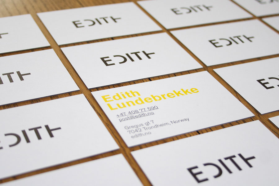
WORK | Inspired by the quote from Dick Bruna: “If you put a very few things on the page, you leave lots of room for the imagination” the new visual identity for Edith was developed. Edith Lundebrekke is a visual artist and works with art and architectural installations. Her work is based on the repetition of simple geometric shapes. She has received particular attention for her works with wooden reliefs, where the experience of colour and shape changes according to the spectator’s movement. The identity developed is based on simplicity and how to challenge the viewer. There has been no desire to recreate something of her art in profile, but rather develop a strong logo with typography and colors which become elements in a clear and strong profile. The work is a collaboration with web designer Eirik Backer, www.kirie.no. See more from EDITH here.
25.05.2013
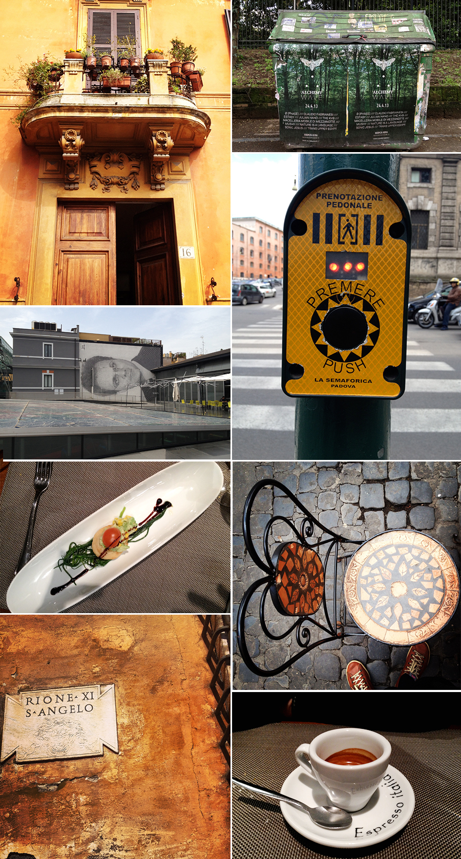
TRAVEL | Even though this was a vacation trip, I spent time looking at details, colors, typography, architecture, food, exhibitions, walls, posters, illustrations, decor, cars, furnitures and magazines.
Rome is a lovely city.
05.05.2013
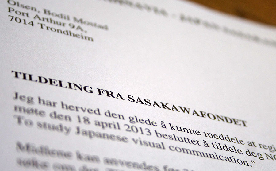
WORK, PERSONAL PROJECTS | Having just received wonderful news; I have been granted a scholarship from The Scandinavia – Japan Sasakawa foundation in connection with a new and exciting project that is under development. In October I will go to Japan where the purpose of the journey is to get an insight into Japanese visual communication seen through western eyes. Exploring the differences and similarities with focus on crossing points. In addition I will learn Japanese bookbinding from Mr. Yo Yamazaki who is a Japanese bookbinder in Tokyo.
The tour will provide a basis to give lectures to students in Scandinavia and possibly Japan, where I can pass on impressions and give an analytical representation of differences and similarities.
There’s more to come.
10.04.2013
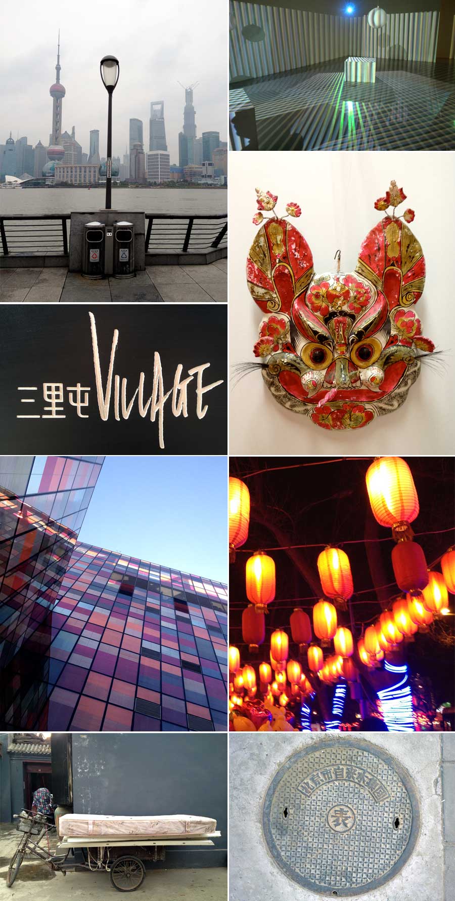
TRAVEL | Followed up my trip to Beijing in 2011. Eight days of researching galleries and museums in connection with a possible exhibition and book. Many meetings, dinners, coffees, great art, exhibitions, pollution, millions of cars, high speed train from Beijing to Shanghai, large contrasts, exciting architecture and nice people.
04.03.2013

WORK | IMELLA is an adventure route in South Troms, north of Norway. The new identity created is based on the specific nature of South Troms, where mountains and sea form a clear and simple symbol. The mountains overlap, which creates new forms and colors and illustrate diversity in experiences and nature. The typography is strong and clear and will thus be suited very well on signs. The typography has also received a unaffected expression, which reflects both the nature of the southern Troms and the values for IMELLA. It is chosen a color palette with an emphasis on nature in southern Troms. 3 main colors illustrate stones, forest and blue mountains. In addition, it is selected 7 additional colors illustrating details in nature such as heather, grass, sky and sun. All the colors together give the profile a clear and consistent picture of IMELLA. See more from IMELLA here.
The development of the identity is a collaboration with illustrator Ingrid Baadnes in ablemagic.
20.02.2013
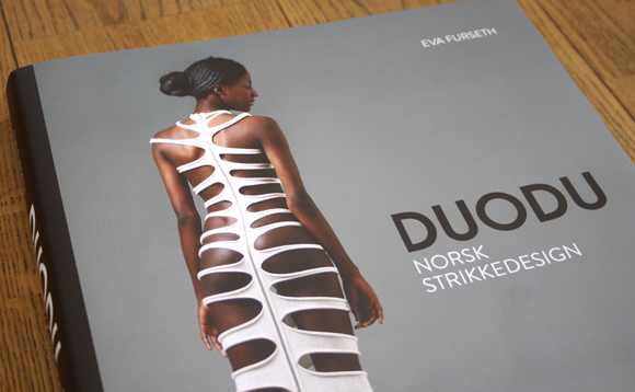
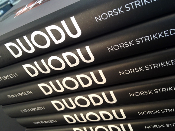
WORK | Direct from the printing company Livonia Print in Latvia the DUODU book just arrived. Excited and happy we flicked through the book and found that the quality of the print, chosen paper and the design looks great. The publisher is Forlaget Schrøder. See more from the DUODU book here.
17.02.2013
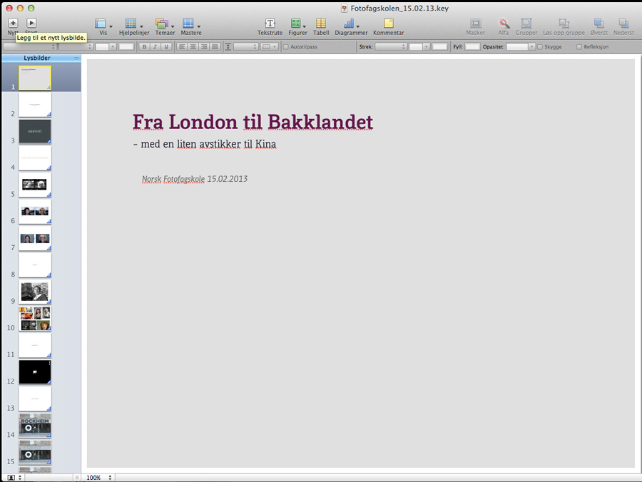
WORK | I was invited to give a lecture for the students of Art Photography at Norsk Fotofagskole, The Norwegian Photography School last Friday. The lecture was titled: From London to Bakklandet – with a slight detour to China. The main theme was to talk about books, typography and identity. However, I talked them through a journey, from my time in London graduating from London College of Communication to the present day, where I work in my own design studio at Bakklandet in Trondheim. I talked about several projects, typography, how I let myself be inspired by books, movies and traveling to different cities in the world, my own work, and how I create my own projects; one of them related to China and a possible exhibition/book. My focus was also to show how identity and personality always can be related to typography and books. I had a great time and the students were responsive and interested.
12.12.2012

PERSONAL PROJECTS | I have a goal to create an annual report for my own business every year, where I can think freely, experiment, explore and challenge myself both on typography, images, layout and content.
Panama is a word, a country or a desired location. Inspired by Janosch and his history The trip to Panama, the story of how the little tiger and the bear traveled to Panama, the theme for the annual report 2011 was to explore the word Panama. The two friends traveled to find happiness and a different country. They walked, looked, examined, explored and talked. And finally they found Panama, the finest country on earth. They found their home.
I explored my own space, my life, my everyday world. I explored a word. Panama. Typography, placement and colors. What is the dream of the ultimate? Where is it? When is enough enough? What should be communicated? When should we communicate? The theme in the annual report is a trial and error for a phrase. Nothing predestined, no rules or restrictions. Maybe this could be the start of the idea of eventually finding a cross between defined rules for a given profile and to be free? The answer is not here, this is the start of something that can be a new and exciting way to develop a visual profile.
Or I might end up to where I initially started. Inspired by the tiger and the bear.
11.12.2012


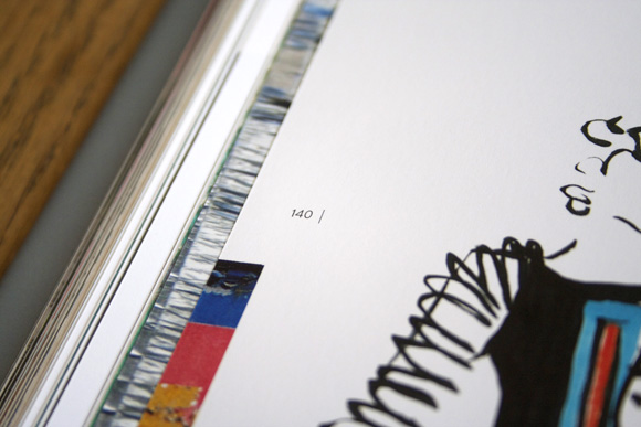
WORK IN PROGRESS | After working on the book for about a month, we can now see the outline of the book. Using images of the clothes combined with sketches and inspiration images, the pages are starting to look very exciting. After some experimentation with different typography I have selected the font Brandon Grotesque as the main font. Brandon Grotesque is a sans serif type family of six weights plus matching italics. It was designed by Hannes von Döhren in 2009/10. Influenced by the geometric-style sans serif faces that were popular during the 1920s and 30s, the fonts are based on geometric forms that have been optically corrected for better legibility. This is a conscious choice because Anne and Rita in Duodu is strongly affected by the style of 1920s and 30s. Brandon Grotesque has a functional look with a warm touch. Brandon Grotesque is equipped for complex, professional typography. Brandon Grotesque won the TDC2 Award, 2011.
In addition to the font/type Brandon Grotesque I have chosen capital letters in the font Arnold Boecklin as an intro to each chapter. The capital letters act as large decorative Illustrations through the book. This expression is related to Anne and Rita’s inspiration and fascination for the Jugend style movement. The font, Arnold Boecklin, appeared in 1904 with the font foundry Otto Weisert. Traces of the floral forms of the Jugend style can still be seen in this typeface. Alphabets of this type were mainly meant for larger point sizes, as on posters. A decorative feel was much more important than legibility, and Arnold Boecklin was of particular importance to the book design of the Jugend style movement.
The work continues and the launch date will be when Duodu have their 15-year anniversary February 28 2013.