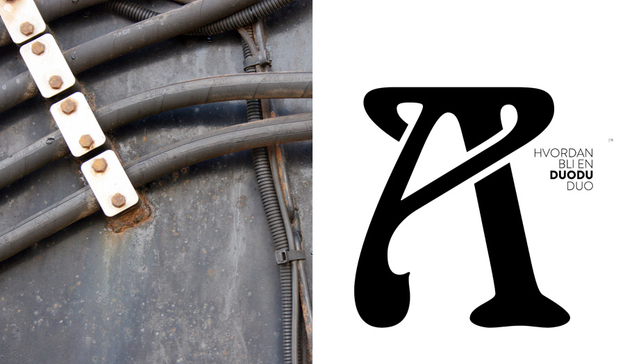
The Duodu book begins to get an identity
11.12.2012WORK IN PROGRESS | After working on the book for about a month, we can now see the outline of the book. Using images of the clothes combined with sketches and inspiration images, the pages are starting to look very exciting. After some experimentation with different typography I have selected the font Brandon Grotesque as the main font. Brandon Grotesque is a sans serif type family of six weights plus matching italics. It was designed by Hannes von Döhren in 2009/10. Influenced by the geometric-style sans serif faces that were popular during the 1920s and 30s, the fonts are based on geometric forms that have been optically corrected for better legibility. This is a conscious choice because Anne and Rita in Duodu is strongly affected by the style of 1920s and 30s. Brandon Grotesque has a functional look with a warm touch. Brandon Grotesque is equipped for complex, professional typography. Brandon Grotesque won the TDC2 Award, 2011.
In addition to the font/type Brandon Grotesque I have chosen capital letters in the font Arnold Boecklin as an intro to each chapter. The capital letters act as large decorative Illustrations through the book. This expression is related to Anne and Rita’s inspiration and fascination for the Jugend style movement. The font, Arnold Boecklin, appeared in 1904 with the font foundry Otto Weisert. Traces of the floral forms of the Jugend style can still be seen in this typeface. Alphabets of this type were mainly meant for larger point sizes, as on posters. A decorative feel was much more important than legibility, and Arnold Boecklin was of particular importance to the book design of the Jugend style movement.
The work continues and the launch date will be when Duodu have their 15-year anniversary February 28 2013.


