


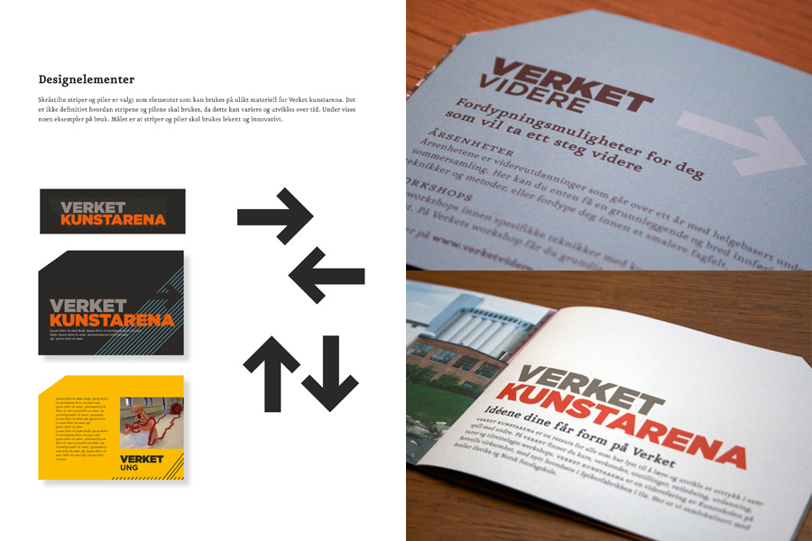
VERKET
The visual identity is based on the premise that Verket Art Arena is a place where students work diligently, systematically. and methodically. The aim of the identity was to evoke the feeling of a ‘factory’, conveying power and energy. The primary colours in the palette are black/grey and orange. Additionally, each course has its own colour related to different business areas.
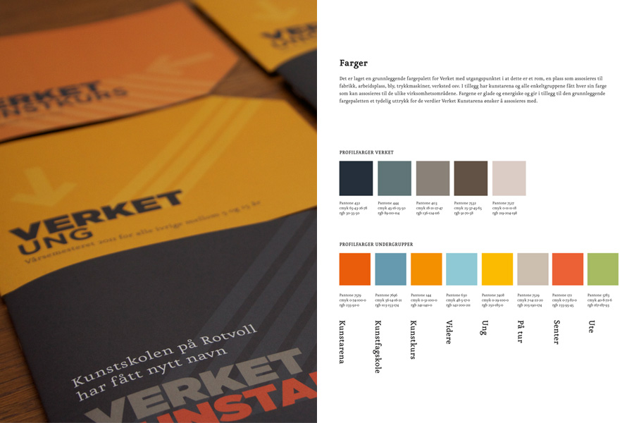
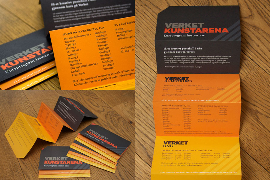