– a blog about my work, research, ideas, typography and passion for books.
18.01.2015
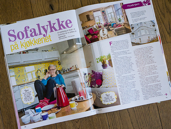
I always try to find something that makes me happy. When I was looking for something that could freshen up my head, I bought a bright yellow wallpaper with colorful birds to have by my kitchen counter. Four pages in Norsk Ukeblad this week where I am interviewed about my great apartment, two sofas in the kitchen, colors and how I work.
Written by Veronika Sørum. Photos by Lena Knutli.
15.12.2014
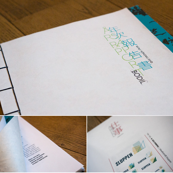
PERSONAL PROJECT | An important part of 2013 was a study trip to Japan. The trip was related to support from The Scandinavia – Japan Sasakawa Foundation, where the gain was to get an insight into Japanese visual communication. The annual report for previous year is therefore characterized by the trip and my experiences with what I observed combined with a course in Japanese bookbinding. I have within the report played and experimented with Japanese and Western typography. What happens when these two merge and we get a brand new expression? To make an annual report every year for my own company is a great way to document all my work and write about my experiences in my own way. I try to challenge myself every year to approach a new theme and a new way of using images and typography.
18.12.2013
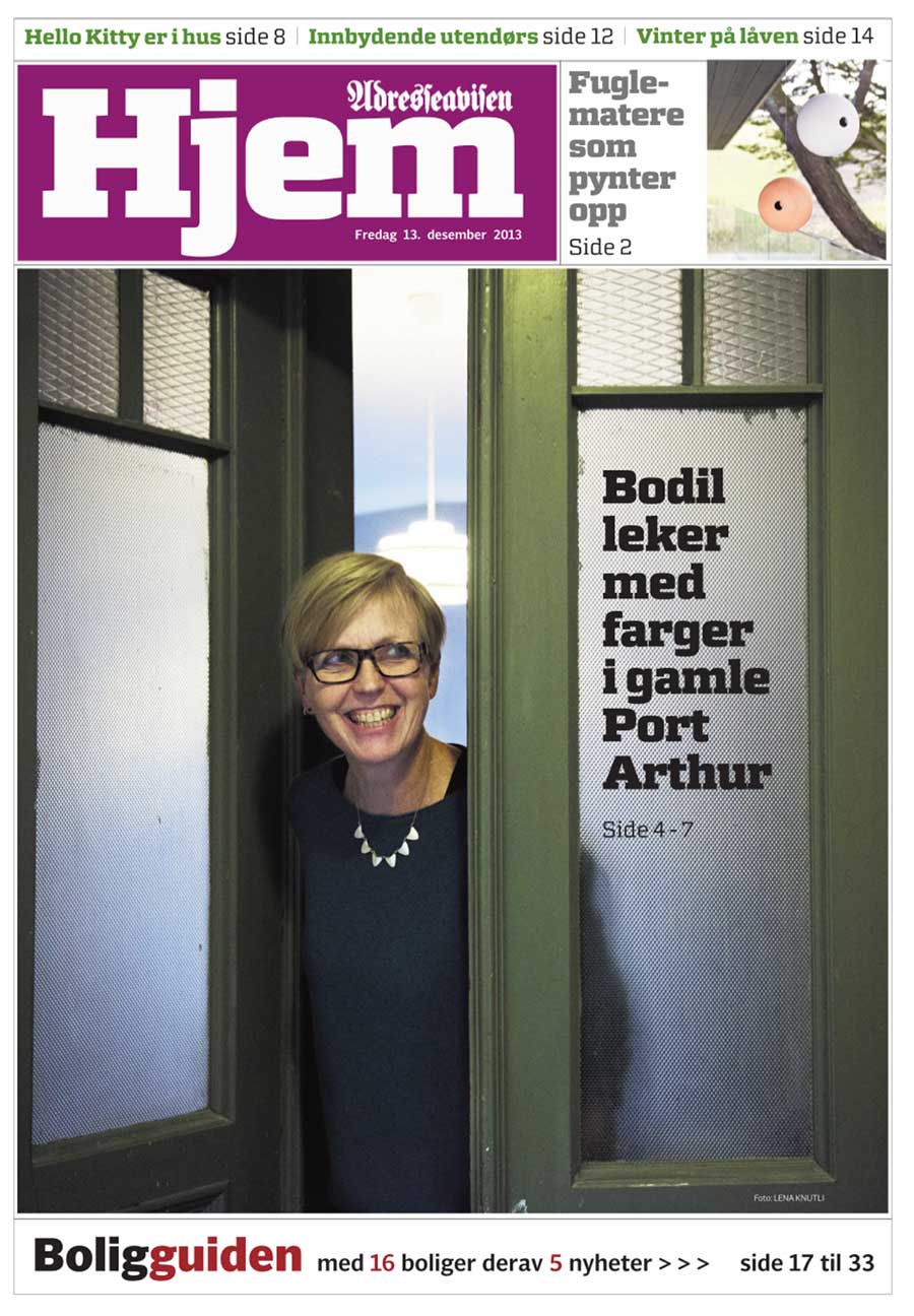
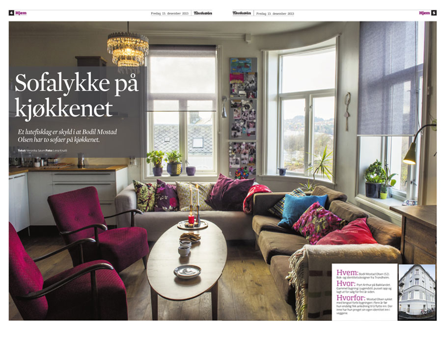
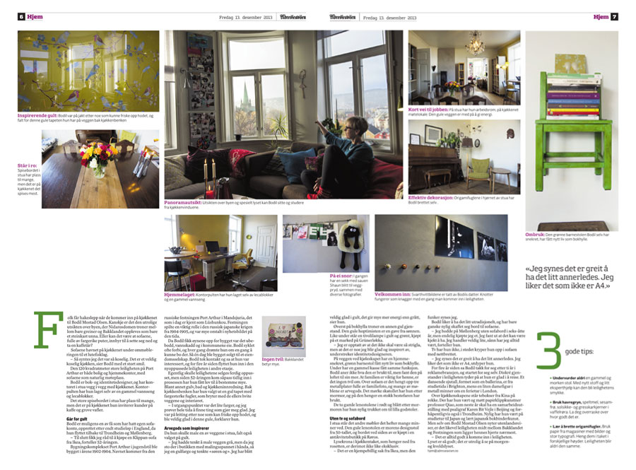
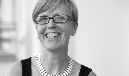
With 5 pages in Adresseavisen, Veronika Sørum has written a great story about how I live and work in my lovely apartment at Port Arthur. Great pictures taken by the photographer Lena Knutli shows my sofas in the kitchen, my furnitures I inherited from my mother and my grandmother and the view towards the Dome and the area Bakklandet.
There is no doubt, I love the place I live and work.
18.12.2013
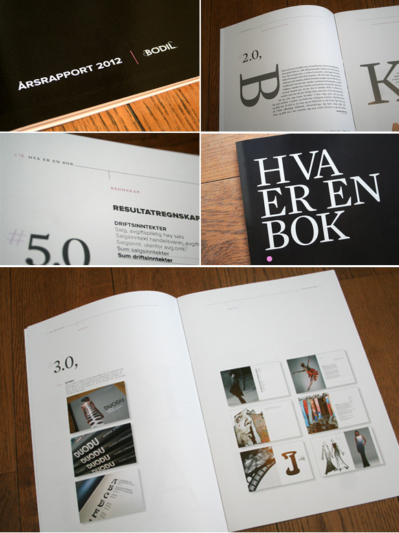
PERSONAL PROJECTS | To look back at 2012 feels a bit like having settled. Not with all of me but with a toe or two. I love to work with books – the medium that takes us from the beginning to the end, that inspires, informs, challenges, irritates, excites and provides endless adventures. The joy of being a part of the process, see the results and still have the desire to start again.
But the book is changing. The annual report 2012 is about what a book is. Four famous people in Norway have commented on what they think a book is. They expand the perspective, puts me in the mood and challenge me to define what a book is by myself. In 2013 I might settle with four toes…
27.10.2013
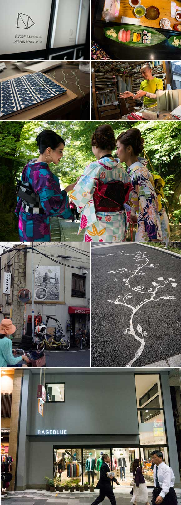
PERSONAL PROJECT, WORK | The starting point for my trip to Japan related to the support from The Scandinavia – Japan Sasakawa Foundation, was to gain an insight into Japanese visual communication.
I visited both Tokyo and Kyoto and documented in the first place the Japanese visual language using the camera. I started wide with many different directions; architecture, pattern, manhole covers, signs, clothing, food, stores, packaging design and posters. The result has been nearly 1000 images. In addition, I visited various galleries, and had specifically benefit from an exhibition at the Ginza Graphic Gallery, where the award-winning graphic designer Rikako Nagashima showed various works. In addition, I worked on making contacts. I had a meeting with the Art Director Kaoru Matsuno at Hara Design Institute/Nippon Design Center. She works closely with Kenya Hara who is also the Art Director for Muji. In addition, I worked two days with Mr. Yamamzaki Yo, where I was trained in ancient Japanese bookbinding techniques. Mr. Yamazaki Yo is a renowned bookbinder in Tokyo.
Given the goal of the trip, it’s been an interesting journey. With the imagery I now hold, it will be interesting to go more in depth of Japanese design in order to relate it to Western design. The contact with Mr. Yamazaki Yo gave me not only a concrete introduction into Japanese bookbinding techniques, but there was also a fundamental insight into the Japanese way of life, aesthetics and accuracy. Kaoru Matsuno gave an insight into how Hara Design Institute works in various design processes.
The journey and the process has given me inspiration to convey impressions through both lectures and a book. The lectures are intended as a process description based on the experiences I have gained. The idea about the book is to create inspiration for both Japanese and Western designers.
An alternative, or as an addition, it is also possible to think of an exhibition. I have been in contact with Hagiso, a small, newly renovated Japanese house in Yanaka, north of Tokyo, that is a venue for art and other events. They are open to offer an exhibition space for the project. The idea of the exhibition is to introduce Japanese and Western design in a possible artistic context with the book and the bookbinding techniques as a starting point.
05.05.2013
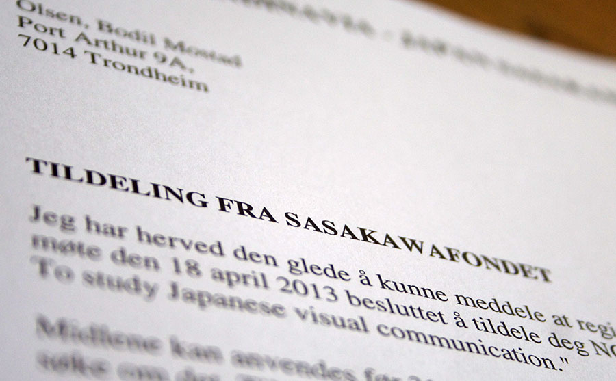
WORK, PERSONAL PROJECTS | Having just received wonderful news; I have been granted a scholarship from The Scandinavia – Japan Sasakawa foundation in connection with a new and exciting project that is under development. In October I will go to Japan where the purpose of the journey is to get an insight into Japanese visual communication seen through western eyes. Exploring the differences and similarities with focus on crossing points. In addition I will learn Japanese bookbinding from Mr. Yo Yamazaki who is a Japanese bookbinder in Tokyo.
The tour will provide a basis to give lectures to students in Scandinavia and possibly Japan, where I can pass on impressions and give an analytical representation of differences and similarities.
There’s more to come.
12.12.2012

PERSONAL PROJECTS | I have a goal to create an annual report for my own business every year, where I can think freely, experiment, explore and challenge myself both on typography, images, layout and content.
Panama is a word, a country or a desired location. Inspired by Janosch and his history The trip to Panama, the story of how the little tiger and the bear traveled to Panama, the theme for the annual report 2011 was to explore the word Panama. The two friends traveled to find happiness and a different country. They walked, looked, examined, explored and talked. And finally they found Panama, the finest country on earth. They found their home.
I explored my own space, my life, my everyday world. I explored a word. Panama. Typography, placement and colors. What is the dream of the ultimate? Where is it? When is enough enough? What should be communicated? When should we communicate? The theme in the annual report is a trial and error for a phrase. Nothing predestined, no rules or restrictions. Maybe this could be the start of the idea of eventually finding a cross between defined rules for a given profile and to be free? The answer is not here, this is the start of something that can be a new and exciting way to develop a visual profile.
Or I might end up to where I initially started. Inspired by the tiger and the bear.