

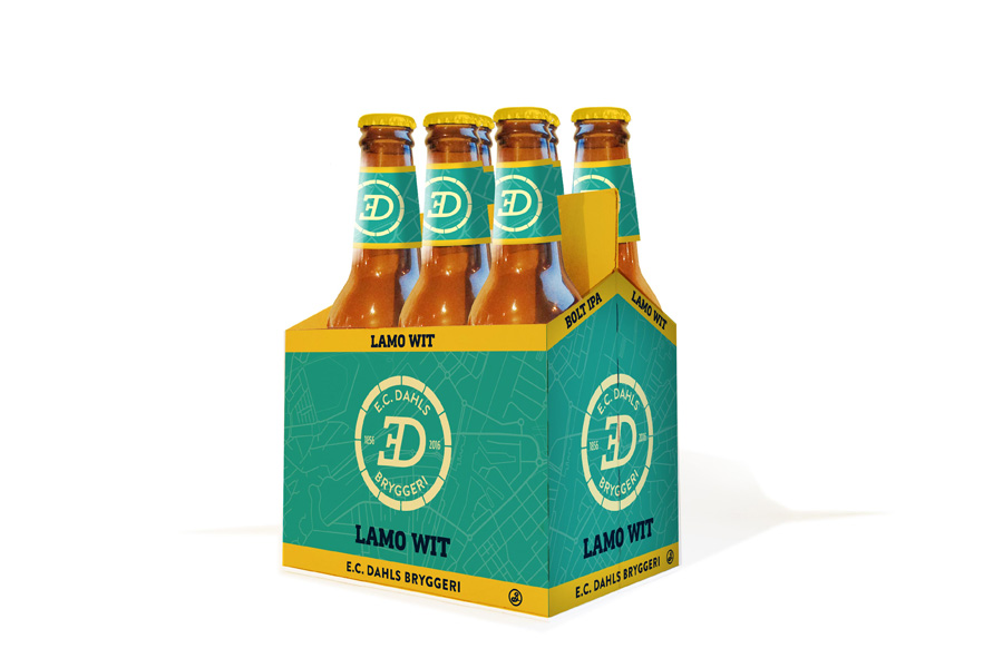
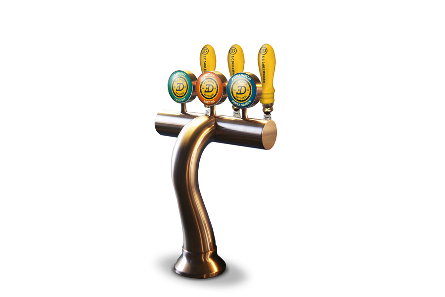
E.C. DAHLS BRYGGERI
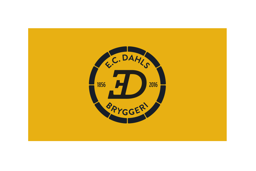
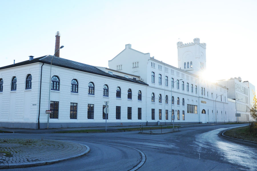
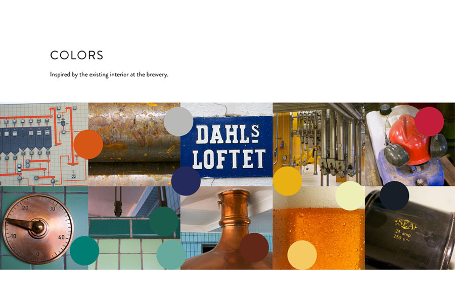
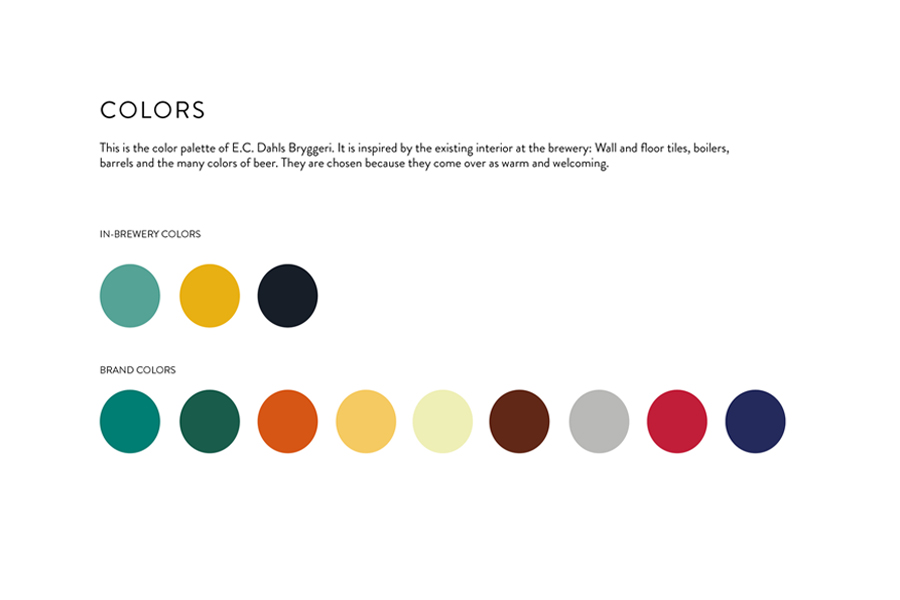
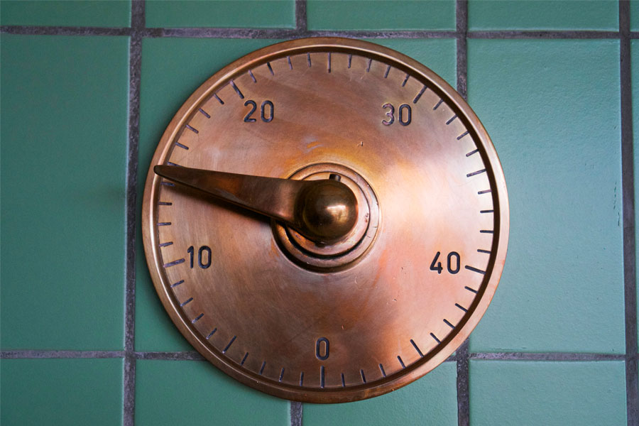
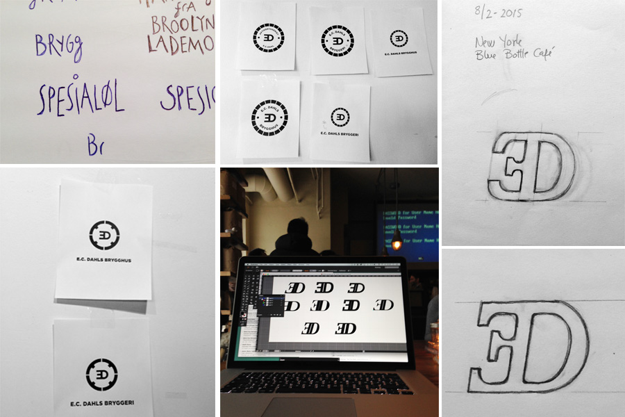
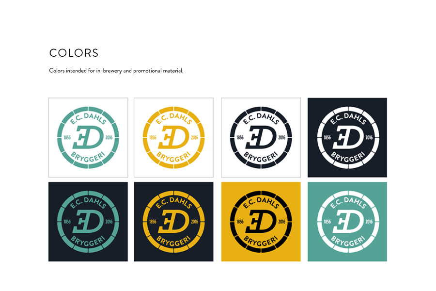
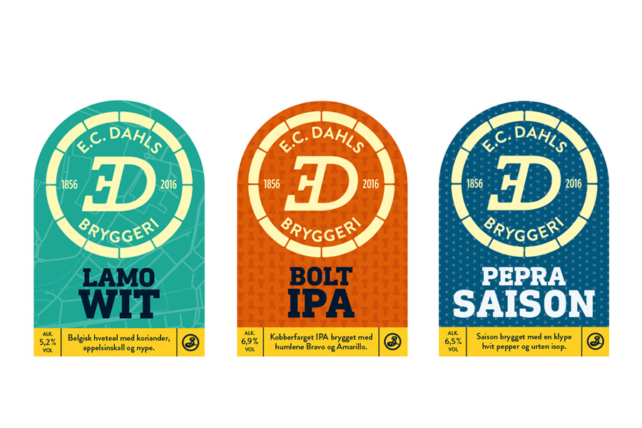
In April 2015, a collaboration between E.C Dahls Bryggeri in Trondheim and Brooklyn Brewery in New York began. Collaborating with ablemagic, a new identity was developed for E.C Dahls. The brewery’s logo has been modernised, featuring a new italicised ‘E’ while retaining elements of the original design. The colour palette draws inspiration from the existing interior of the brewery.
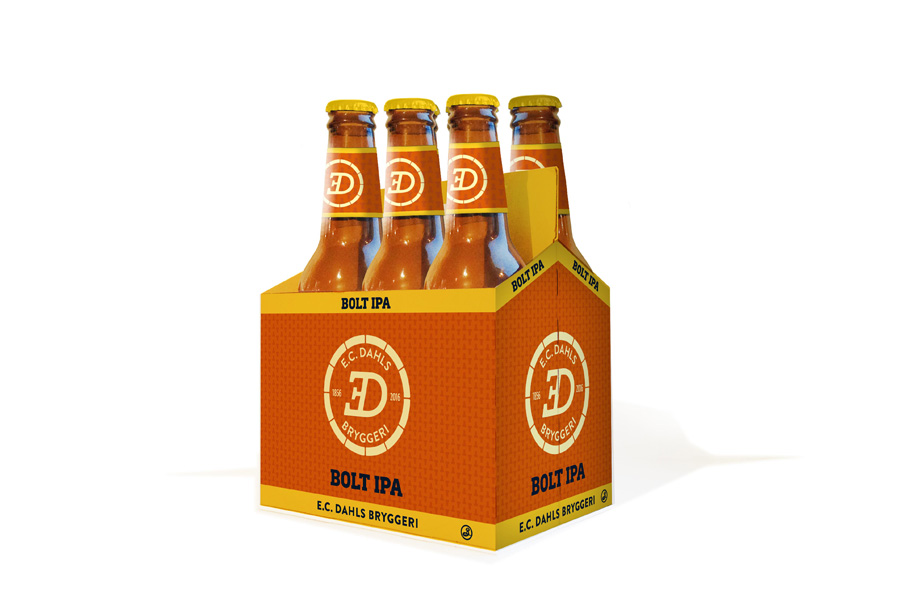
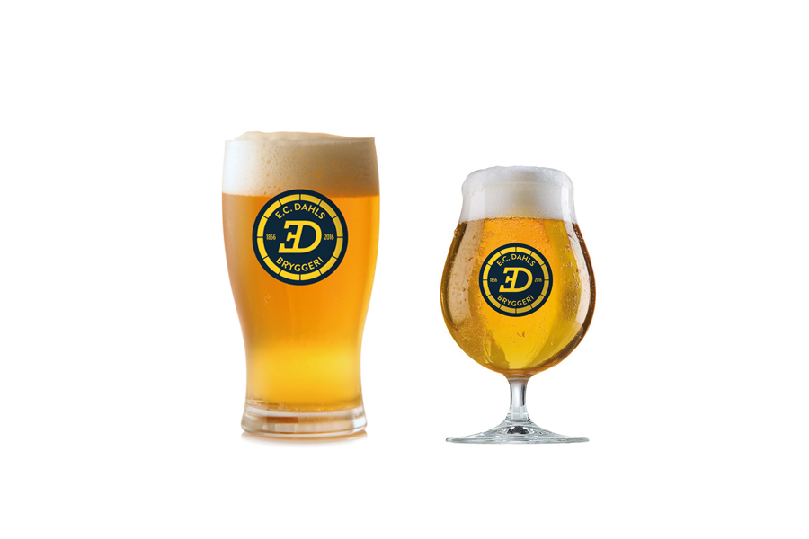
E.C. DAHLS BRYGGERI
In April 2015, a collaboration between E.C Dahls Bryggeri in Trondheim and Brooklyn Brewery in New York began. Collaborating with ablemagic, a new identity was developed for E.C Dahls. The brewery’s logo has been modernised, featuring a new italicised ‘E’ while retaining elements of the original design. The colour palette draws inspiration from the existing interior of the brewery.
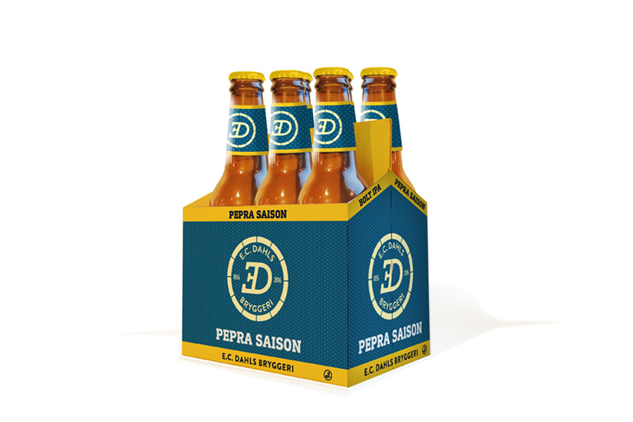
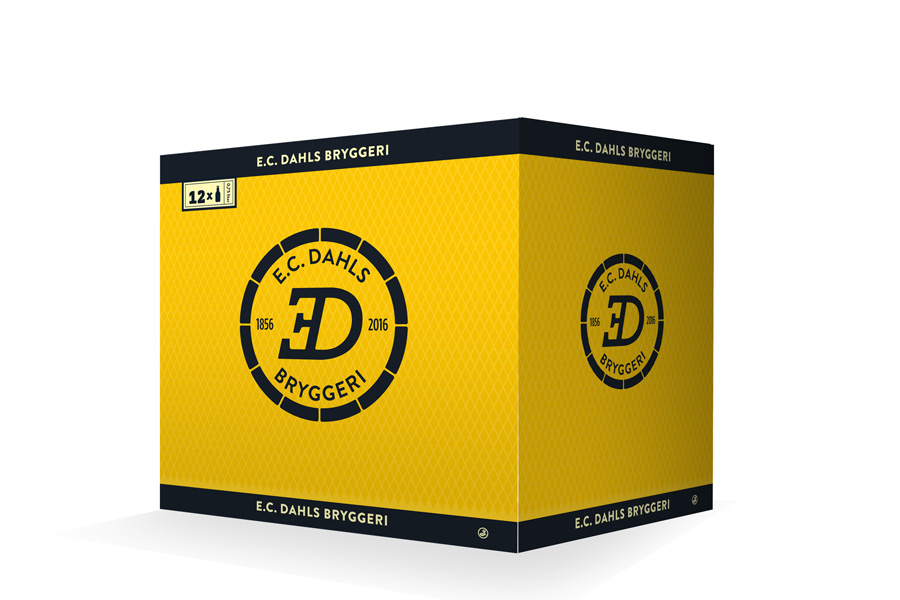